Wednesday, 30 May 2012
Thursday, 24 May 2012
Deploying and Updating Windows Azure Applications
This article describes the various ways that you can deploy and update Windows Azure applications. To fully understand this article, you should read the Windows Azure Application Model article first.
Getting your application up and running on Windows Azure is easy. You simply package (zip) your application and upload it to Windows Azure along with some XML configuration files. Based on the configuration information, Windows Azure determines how many role instances (these are essentially virtual machines or VMs) to provision for each role, determines what OS version and components to put on each role instance, installs your uploaded code on each role instance, and boots them. In most cases, the role instances are up and running your code within minutes. Once initialized, the role instances report into the load balancer, which will now distribute client traffic equally to all the role instances running your Internet-facing application.
Once your role instances (that is, VMs running your application code) are up and running, Windows Azure constantly monitors them to ensure high availability of your applications. If one of your application processes terminates due to an unhandled exception, Windows Azure automatically restarts your application process on the role instance. If the hardware that is running your role instance experiences a failure, Windows Azure detects this, automatically provisions a new role instance, and boots it on other hardware, again ensuring high availability for your application. Because it takes a few minutes for Windows Azure to detect the failing hardware and to provision a new role instance on other hardware, it is highly recommended that you configure your application to run at least two role instances for each unit of code you have running. This way, if one role instance experiences a problem, the load balancer directs requests to the other role instance, ensuring that clients can still reach your application.
In fact, if you examine the Windows Azure Service Level Agreement, you will come across the following text related to the compute services:
We guarantee that when you deploy two or more role instances in different fault and upgrade domains your Internet facing roles will have external connectivity at least 99.95% of the time. Additionally, we will monitor all of your individual role instances and guarantee that 99.9% of the time we will detect when a role instance’s process is not running and initiate corrective action.
While your application is running, Windows Azure ensures that the OS and components are patched periodically with minimal downtime to your applications. Windows Azure also offers ways to scale your application up or down, to change certificates, endpoints, configuration settings, and even to version the code for your application with little or no downtime. This article delves into all the possible deployment and update scenarios.
Finally, if you want to make significant changes to your code, Windows Azure offers a way for you to upload the new code and test it in a staging area while customers access the old code. Then, once you feel confident with the new code, you can move it from staging to production so that new client requests now run against the new code.
The following sections describe how to perform these scenarios in detail.
Before you can deploy an application into the hosted service, you must package (zip) your application for your roles together into a CSPKG file. Your service definition (CSDEF) file must also be embedded into the CSPKG file. In addition, you need to have your service configuration (CSCFG) file ready. These files are discussed in the Windows Azure Application Model article. Then, you upload these files to Windows Azure via the Windows Azure Management Portal or by calling the Create Deployment REST API. You can alternatively deploy your application directly from Windows Azure tooling, such as the Visual Studio tooling in the Windows Azure SDK for .NET or the command line tooling in the Windows Azure SDK for Node.js. With the tooling, the underlying details of creating a CSPKG and uploading it to Windows Azure are handled for you automatically.
Within a few minutes after uploading the files, Windows Azure provisions your role instances and your application is up and running. The figure below shows the CSPKG and CSCFG files that you create on your development computer. The CSPKG file contains the CSDEF file and the code for two roles. After uploading the CSPKG and CSCFG files to Windows Azure via the Service Management API, Windows Azure creates the role instances in the data center. In this example, the CSCFG file indicates that Windows Azure should create three instances of role #1 and two instances of role #2.
![[image]](http://www.windowsazure.com/media/dev-fundamentals-deploying-and-updating-windows-azure-applications-3.jpg)
The most common reason to change the CSCFG file is to change the number of instances running a particular role. However, you can also change configuration setting values or certificates used by a role. If you opt out of automatic OS updates, you can also change the OS version used by all the roles. For more information about OS updates, see Managing Upgrades to the Windows Azure Guest OS.
When scaling a role’s instances, Windows Azure adjusts the number of role instances running each role’s code. Increasing the number of instances for a role does not impact the currently running instances. If you decrease the number of instances for a role, then Windows Azure selects which instances to terminate. Note that instances being terminated are given a chance to shut down cleanly allowing them to save any data on the role instance out to more persistent storage such as SQL Azure, Blobs, or Tables.
In the figure below, a new CSCFG file is uploaded to Windows Azure, indicating that role #1 should have two instances and role #2 should have one instance. Windows Azure then terminates one instance of each role.
![[image]](http://www.windowsazure.com/media/dev-fundamentals-deploying-and-updating-windows-azure-applications-4.jpg)
When changing configuration setting values, the applications on the role instances may have to restart in order to pick up the new configuration values. Windows Azure restarts the role instances using the in-place rolling upgrade technique described earlier. More details about this technique are also discussed in the next section.
Uploading a new CSPKG file causes Windows Azure to replace the code on just the instances running the role whose code you modified by performing an in-place upgrade. This means that Windows Azure will stop some of the instances running the old version of the code, upgrade the instances with the new version of the code (extracted from the CSPKG file), and then restart the instances. Once the instances running the new code have been up and running successfully (considered healthy) for approximately 15 minutes, Windows Azure will perform the same upgrade on some of the other instances still running the old version of the code. It will continue to do this until all instances are running the new version of the code. An in-place upgrade ensures that your application always has some instances available to process client requests. This also means that your application will have some instances running old versions of your code and new versions of your code simultaneously and you must ensure that your application code can handle this successfully.
To ensure that all instances running a role are not down simultaneously, Windows Azure uses upgrade domains (UDs). By default, an application has five upgrade domains, and Windows Azure will distribute role instances across all of these upgrade domains. For example, if you have two instances running a web role and three instances running a worker role, then Windows Azure will automatically distribute the instances across the upgrade domains as shown in the table below:
If you upload a CSPKG with new code for both roles, then Windows Azure will first stop all the instances in UD #0. While Windows Azure updates the code on these instances, the load balancer directs client requests to the other three instances, so your application is never completely offline. After the instances in UD #0 have the new code installed, they are restarted, and the load balancer begins directing traffic to them again. After the new instances are up and running (healthy) for approximately 15 minutes, Windows Azure stops the instances in UD #1, upgrades their code, and restarts them. Finally, after all the role instances in UD #1 have been up and running healthy for 15 minutes, Windows Azure stops the instance in UD #2, upgrades its code, and restarts it.
Because of upgrade domains, you never have a role completely offline while upgrades are being performed as long as you have at least two instances running each role’s code. You specify the number of upgrade domains you want your application to have in its CSDEF file. The minimum is one (which should be avoided) and the maximum is 20.
If you prefer, instead of having Windows Azure automatically walk each upgrade domain every 15 minutes, you can manually walk each upgrade domain. That is, you can upgrade the instances in one upgrade domain and then see how your new code is performing (perhaps by using Remote Desktop to access a specific role instance). Then, when you are satisfied, you can tell Windows Azure to upgrade the next upgrade domain. If you are unhappy with your code, you can also tell Windows Azure to roll back the change forcing the instances in the already-walked upgrade domains to revert back to the previous version of the code.
To perform a major code change, you’d create the new CSPKG file (containing the new version of your roles’ code) & the corresponding CSCFG file. Then, you’d deploy these new files into your hosted service’s staging environment via the Windows Azure Management Portal or by calling the Create Deployment REST API. You can alternatively deploy your application directly from Windows Azure tooling, such as the Visual Studio tooling in the Windows Azure SDK for .NET or the command line tooling in the Windows Azure SDK for Node.js. With the tooling, the underlying details of creating a CSPKG and uploading it to Windows Azure are handled for you automatically.
Windows Azure deploys your new application to a new set of role instances and Windows Azure assign a globally unique identifier (GUID) as a special DNS prefix when an application is deployed to the staging environment. The new version of your application is now up and running in your desired data center and accessible for you to test at guid.cloudapp.net.
Note that the old version of your application is still publicly available to clients at the preferred DNS prefix and that you are charged for the instances that are running your production (old) code as well as the instances that are running your staging (new) code. The figure below shows version 1.0 of your application running in the production environment and version 2.0 running in the staging environment.
![[image]](http://www.windowsazure.com/media/dev-fundamentals-deploying-and-updating-windows-azure-applications-5.jpg)
Once you have sufficiently tested your new code in staging using guid.cloudapp.net, you tell Windows Azure to put it into production by performing what is called a Virtual IP (VIP) Swap. This causes Windows Azure to reprogram the load balancer so that it now directs client traffic sent to prefix.cloudapp.net to the instances running the new version of your code. This means that clients immediately start accessing the new version of your application and no longer have access to the old version. Again, clients experience no downtime. The figure below shows how the load balancer directs traffic after a VIP Swap has been performed.
![[image]](http://www.windowsazure.com/media/dev-fundamentals-deploying-and-updating-windows-azure-applications-6.jpg)
Note that after you swap the VIPs, the old version of your application is still running and is now available in the staging environment at guid.cloudapp.net. While this version is still running, you are still being charged for the role instances. You can now delete the deployment containing the old version of your application to reduce charges. Alternatively, you can keep it running for some time and, if any problems appear with the new version of your application, you can swap the VIPs again making the old code accessible to clients while you fix the new version.
Table of Contents
- Benefits of the Windows Azure Deployment Model
- Lifecycle of a Windows Azure Application
- Scenario #1: New Deployment
- Scenario #2: Configuration Change
- Scenario #3: Incremental Code Upgrade
- Scenario #4: Major Upgrade
- References
Benefits of the Windows Azure Deployment Model
In a traditional server hosting model, when you deploy an application to a host, you have to worry about patching the operating system (OS), various components, and your application code itself. In addition, you need to concern yourself with how to perform these updates with minimal downtime to your application so that it remains responsive to client requests. Windows Azure handles deployment and update issues like these automatically.Getting your application up and running on Windows Azure is easy. You simply package (zip) your application and upload it to Windows Azure along with some XML configuration files. Based on the configuration information, Windows Azure determines how many role instances (these are essentially virtual machines or VMs) to provision for each role, determines what OS version and components to put on each role instance, installs your uploaded code on each role instance, and boots them. In most cases, the role instances are up and running your code within minutes. Once initialized, the role instances report into the load balancer, which will now distribute client traffic equally to all the role instances running your Internet-facing application.
Once your role instances (that is, VMs running your application code) are up and running, Windows Azure constantly monitors them to ensure high availability of your applications. If one of your application processes terminates due to an unhandled exception, Windows Azure automatically restarts your application process on the role instance. If the hardware that is running your role instance experiences a failure, Windows Azure detects this, automatically provisions a new role instance, and boots it on other hardware, again ensuring high availability for your application. Because it takes a few minutes for Windows Azure to detect the failing hardware and to provision a new role instance on other hardware, it is highly recommended that you configure your application to run at least two role instances for each unit of code you have running. This way, if one role instance experiences a problem, the load balancer directs requests to the other role instance, ensuring that clients can still reach your application.
In fact, if you examine the Windows Azure Service Level Agreement, you will come across the following text related to the compute services:
We guarantee that when you deploy two or more role instances in different fault and upgrade domains your Internet facing roles will have external connectivity at least 99.95% of the time. Additionally, we will monitor all of your individual role instances and guarantee that 99.9% of the time we will detect when a role instance’s process is not running and initiate corrective action.
While your application is running, Windows Azure ensures that the OS and components are patched periodically with minimal downtime to your applications. Windows Azure also offers ways to scale your application up or down, to change certificates, endpoints, configuration settings, and even to version the code for your application with little or no downtime. This article delves into all the possible deployment and update scenarios.
Lifecycle of a Windows Azure Application
Once you have deployed your application to Windows Azure, you have many ways to manage it and the role instances on which it is running. For example, you can easily scale the number of instances for any given role up or down in order to meet business needs. You can also change configuration settings and distribute the changes out to the role instances without having to redeploy any of the code. If you discover a bug or want to add a small feature to your role code, you can upload the new code to Windows Azure and have it distribute it to the appropriate role instances. Windows Azure does this while ensuring that your application remains accessible to your customers; the details of how it does this are described later in this article.Finally, if you want to make significant changes to your code, Windows Azure offers a way for you to upload the new code and test it in a staging area while customers access the old code. Then, once you feel confident with the new code, you can move it from staging to production so that new client requests now run against the new code.
The following sections describe how to perform these scenarios in detail.
Scenario #1: New Deployment
To deploy an application to Windows Azure, you must first create a hosted service. You can do so via the Windows Azure Management Portal, via the Create Hosted Service REST API, or automatically from Windows Azure tooling when deploying your application. Both the Visual Studio tooling in the Windows Azure SDK for .NET and the command line tooling in the Windows Azure SDK for Node.js support creating hosted services. A hosted service allows you to select one of the six Windows Azure data centers around the world where your applications will be deployed, and also allows you to reserve a DNS prefix that clients will use to access your services. The full DNS name will be something like prefix.cloudapp.net. Of course, you can create a DNS record that maps your custom domain name to the Windows Azure DNS name. For more information, see the Windows Azure Application Model article.Before you can deploy an application into the hosted service, you must package (zip) your application for your roles together into a CSPKG file. Your service definition (CSDEF) file must also be embedded into the CSPKG file. In addition, you need to have your service configuration (CSCFG) file ready. These files are discussed in the Windows Azure Application Model article. Then, you upload these files to Windows Azure via the Windows Azure Management Portal or by calling the Create Deployment REST API. You can alternatively deploy your application directly from Windows Azure tooling, such as the Visual Studio tooling in the Windows Azure SDK for .NET or the command line tooling in the Windows Azure SDK for Node.js. With the tooling, the underlying details of creating a CSPKG and uploading it to Windows Azure are handled for you automatically.
Within a few minutes after uploading the files, Windows Azure provisions your role instances and your application is up and running. The figure below shows the CSPKG and CSCFG files that you create on your development computer. The CSPKG file contains the CSDEF file and the code for two roles. After uploading the CSPKG and CSCFG files to Windows Azure via the Service Management API, Windows Azure creates the role instances in the data center. In this example, the CSCFG file indicates that Windows Azure should create three instances of role #1 and two instances of role #2.
Scenario #2: Configuration Change
Once an application is deployed and running, you can reconfigure the roles by modifying the CSCFG file in use. You can edit the CSCFG file directly using the Windows Azure Management Portal or you can upload a new CSCFG file via the Windows Azure Management Portal or by calling the Change Deployment Configuration REST API.The most common reason to change the CSCFG file is to change the number of instances running a particular role. However, you can also change configuration setting values or certificates used by a role. If you opt out of automatic OS updates, you can also change the OS version used by all the roles. For more information about OS updates, see Managing Upgrades to the Windows Azure Guest OS.
When scaling a role’s instances, Windows Azure adjusts the number of role instances running each role’s code. Increasing the number of instances for a role does not impact the currently running instances. If you decrease the number of instances for a role, then Windows Azure selects which instances to terminate. Note that instances being terminated are given a chance to shut down cleanly allowing them to save any data on the role instance out to more persistent storage such as SQL Azure, Blobs, or Tables.
In the figure below, a new CSCFG file is uploaded to Windows Azure, indicating that role #1 should have two instances and role #2 should have one instance. Windows Azure then terminates one instance of each role.
When changing configuration setting values, the applications on the role instances may have to restart in order to pick up the new configuration values. Windows Azure restarts the role instances using the in-place rolling upgrade technique described earlier. More details about this technique are also discussed in the next section.
Scenario #3: Incremental Code Upgrade
If you want to make an incremental code upgrade to a role — for example, to fix a bug or add a small feature — you can create a new CSPKG file containing the new code and upload it to Windows Azure via the Windows Azure Management Portal or by calling the Upgrade Deployment REST API. You can alternatively deploy your application directly from Windows Azure tooling, such as the Visual Studio tooling in the Windows Azure SDK for .NET or the command line tooling in the Windows Azure SDK for Node.js. With the tooling, the underlying details of creating a CSPKG and uploading it to Windows Azure are handled for you automatically.Uploading a new CSPKG file causes Windows Azure to replace the code on just the instances running the role whose code you modified by performing an in-place upgrade. This means that Windows Azure will stop some of the instances running the old version of the code, upgrade the instances with the new version of the code (extracted from the CSPKG file), and then restart the instances. Once the instances running the new code have been up and running successfully (considered healthy) for approximately 15 minutes, Windows Azure will perform the same upgrade on some of the other instances still running the old version of the code. It will continue to do this until all instances are running the new version of the code. An in-place upgrade ensures that your application always has some instances available to process client requests. This also means that your application will have some instances running old versions of your code and new versions of your code simultaneously and you must ensure that your application code can handle this successfully.
To ensure that all instances running a role are not down simultaneously, Windows Azure uses upgrade domains (UDs). By default, an application has five upgrade domains, and Windows Azure will distribute role instances across all of these upgrade domains. For example, if you have two instances running a web role and three instances running a worker role, then Windows Azure will automatically distribute the instances across the upgrade domains as shown in the table below:
| UD #0 | UD #1 | UD #2 | UD #3 | UD #4 |
| Web role Instance #1 | Web role Instance #2 | (n/a) | (n/a) | (n/a) |
| Worker role Instance #1 | Worker role Instance #2 | Worker role Instance #3 | (n/a) | (n/a) |
If you upload a CSPKG with new code for both roles, then Windows Azure will first stop all the instances in UD #0. While Windows Azure updates the code on these instances, the load balancer directs client requests to the other three instances, so your application is never completely offline. After the instances in UD #0 have the new code installed, they are restarted, and the load balancer begins directing traffic to them again. After the new instances are up and running (healthy) for approximately 15 minutes, Windows Azure stops the instances in UD #1, upgrades their code, and restarts them. Finally, after all the role instances in UD #1 have been up and running healthy for 15 minutes, Windows Azure stops the instance in UD #2, upgrades its code, and restarts it.
Because of upgrade domains, you never have a role completely offline while upgrades are being performed as long as you have at least two instances running each role’s code. You specify the number of upgrade domains you want your application to have in its CSDEF file. The minimum is one (which should be avoided) and the maximum is 20.
If you prefer, instead of having Windows Azure automatically walk each upgrade domain every 15 minutes, you can manually walk each upgrade domain. That is, you can upgrade the instances in one upgrade domain and then see how your new code is performing (perhaps by using Remote Desktop to access a specific role instance). Then, when you are satisfied, you can tell Windows Azure to upgrade the next upgrade domain. If you are unhappy with your code, you can also tell Windows Azure to roll back the change forcing the instances in the already-walked upgrade domains to revert back to the previous version of the code.
Scenario #4: Major Upgrade
Windows Azure also offers a way for you to make a major new release of your application without your application incurring any downtime. A major change is one in which an in-place upgrade won’t work, for example because your application can’t handle having old versions and new versions of roles running side-by-side during the time it takes to upgrade all the upgrade domains. An example of this might be if you were changing the kinds of roles used within your application.To perform a major code change, you’d create the new CSPKG file (containing the new version of your roles’ code) & the corresponding CSCFG file. Then, you’d deploy these new files into your hosted service’s staging environment via the Windows Azure Management Portal or by calling the Create Deployment REST API. You can alternatively deploy your application directly from Windows Azure tooling, such as the Visual Studio tooling in the Windows Azure SDK for .NET or the command line tooling in the Windows Azure SDK for Node.js. With the tooling, the underlying details of creating a CSPKG and uploading it to Windows Azure are handled for you automatically.
Windows Azure deploys your new application to a new set of role instances and Windows Azure assign a globally unique identifier (GUID) as a special DNS prefix when an application is deployed to the staging environment. The new version of your application is now up and running in your desired data center and accessible for you to test at guid.cloudapp.net.
Note that the old version of your application is still publicly available to clients at the preferred DNS prefix and that you are charged for the instances that are running your production (old) code as well as the instances that are running your staging (new) code. The figure below shows version 1.0 of your application running in the production environment and version 2.0 running in the staging environment.
Once you have sufficiently tested your new code in staging using guid.cloudapp.net, you tell Windows Azure to put it into production by performing what is called a Virtual IP (VIP) Swap. This causes Windows Azure to reprogram the load balancer so that it now directs client traffic sent to prefix.cloudapp.net to the instances running the new version of your code. This means that clients immediately start accessing the new version of your application and no longer have access to the old version. Again, clients experience no downtime. The figure below shows how the load balancer directs traffic after a VIP Swap has been performed.
Note that after you swap the VIPs, the old version of your application is still running and is now available in the staging environment at guid.cloudapp.net. While this version is still running, you are still being charged for the role instances. You can now delete the deployment containing the old version of your application to reduce charges. Alternatively, you can keep it running for some time and, if any problems appear with the new version of your application, you can swap the VIPs again making the old code accessible to clients while you fix the new version.
References
Wednesday, 23 May 2012
Pretty cool scrolling effect...
http://johnpolacek.github.com/scrollorama/?goback=%2Egde_4285452_member_117858751
How To Use
Disclaimer: This is an experimental, just-for-fun sort of project and hasn’t been thoroughly tested.
Design and build your site, dividing your content into blocks.
★ ★ ★
Embed scrollorama.js after jQuery and initialize the plugin, passing the blocks class selector as a parameter.
$(document).ready(function() {
    var scrollorama = $.scrollorama({
        blocks:'.scrollblock'
    });
});
★ ★ ★
Target an element and animate its properties.
scrollorama.animate('#example1',{
    duration:400, property:'opacity'
})
The animation parameters you can use are:
- duration number of pixels of scrolling the animation lasts
- delay number of pixels of scrolling before the animation starts(animation is set to begin when the top of the scroll block is at the bottom of browser window)
- property css property being animated (must be numeric)
- start value of the css property at the start of the animation (if unassigned, will be the element’s current property value)
- end value of the css property at the end of the animation (if unassigned, will be the element’s current property value)
- pin set to true if you want the scroll block to be pinned during its animations (note: block will be pinned for all its element’s animations)
- easing 'bounce baby, bounce.' use the same easing equations you're used to. (if unassigned, will be a linear transition)
★ ★ ★
Hook into the onBlockChange event.
scrollorama.onBlockChange(function() {
    alert('You just scrolled to block#'+scrollorama.blockIndex);
});
★ ★ ★
Note: If you are not using the pinning feature, it is recommended you disable it. Pinning requires scroll blocks to be converted to absolute positioning, which can break some layouts.
$(document).ready(function() {
    var scrollorama = $.scrollorama({
        enablePin:false
    });
});
Monday, 21 May 2012
ASP.NET 4.5 Test-Drive - To Upgrade or Not to Upgrade?
In the upcoming versions of Microsoft Web development tools, ASP.NET makes data binding more flexible while ASP.NET MVC makes creating AJAX applications and building mobile applications easier, among other goodies in both environments.
Before the end of the year, Web developers will have a new version of Visual Studio (11), ASP.NET (4.5) and ASP.NET MVC (4). Here's a look at what's new in ASP.NET, followed by new features in ASP.NET MVC. There are enough new goodies that this article will just concentrate on what's new in the presentation layer in both toolsets.
There won't be room, for instance, for any discussion of the new features available for developers who are creating their own HttpHandlers. (Note that these are beta products, and could change before official release.)
In ASP.NET 4.5, one of the first things you'll notice if you use the Web Application template project is that the content for the default.aspx page is now completely useless. I've never been a big fan of the pages added in the default Web Application template, because most developers (I suspect) will need to replace them with their own pages almost immediately. However, the new default.aspx page doesn't even pretend to be supporting an application. Instead, the page now offers advice to the developer as to what to do next -- no detail on how to do it, mind you, just good advice (such as "Configure membership"). To be fair, the default login and change password pages are probably useful (you might be able to keep them), and the default master page is relatively innocuous.
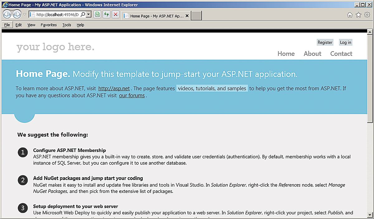
Figure 1. The new ASP.NET default.aspx page features a new look and a bunch of content you'll want to delete immediately.
HTML- and Client-Side-Related Changes
If you're looking for new ASP.NET controls in the ASP.NET Web Forms toolbox once you start building pages, you're going to be disappointed. The changes in ASP.NET 4.5 are all about what the existing controls -- especially the DataViews -- will do, rather than adding new controls. You also won't see any new controls in the HTML section of the toolbox, but that doesn't mean they aren't there.
Visual Studio 11 IntelliSense supports the new HTML5 tags out of the box. The new default.aspx page includes section tags, for instance, and IntelliSense shows that the related header, footer and article tags are also known to Visual Studio. These new tags mean you can stop using <span> and <div> tags with Cascading Style Sheet (CSS) classes to structure related elements on your page, and use tags dedicated to that task.
If you use an HTML5 tag with an attribute that accepts URLs, you can use the ASP.NET "~" operator to mark the "current site." And if you decide to use some of the new HTML5 input tags, the ASP.NET Validator controls and the UpdatePanel will work with them.
On the older HTML tags, the new HTML5 attributes (including the custom data attributes and the Accessible Rich Internet Applications, or ARIA, accessibility attributes, among others) are also supported in IntelliSense. Because the latest version of jQuery supports the data attributes (through the data function), this gives you another way to organize elements in addition to a tool for managing data that's related to an element but that you don't want to display.
More importantly for Web Forms developers, the TextBox TextMode property now supports the new HTML5 options such as Color, DateTime, Number and so on. The FileUpload control supports uploading multiple files if you set its AllowMultiple property to True.
To retrieve all of the uploaded files, you use the control's PostedFiles collection, like so:
For Each file In Me.FileUpload1.PostedFiles
   file.SaveAs(Server.MapPath(file.FileName))
Next
For these items, remember that it's up to the browser as to whether those tags and attributes will be recognized.
The ASP.NET team has taken unobtrusive JavaScript to heart for client-side validation by moving virtually all the JavaScript validation out of the page. You don't have to do anything to make this happen: The option is set through the Validation Settings: UnobtrusiveValidationMode added in the appSettings section of the web.config by default.
Another improvement in client-side-related validation: If a user in previous versions of ASP.NET entered anything that looked suspiciously like HTML or scripting into a data entry control (and ASP.NET was very suspicious), the page blew up. By default, ASP.NET 4.5 sets the new requestValidationMode attribute on the httpRuntime attribute to "4.5," which positions you to stop the page from blowing up if the user enters suspicious content. You'll need to set the ValidateRequestMode property to Disabled on the controls or pages on which you want to permit the user to enter HTML (the default for the property is "Inherit").
Simplifying Binding
A set of changes to the DataView controls (for instance, GridView, DataList and so on) means that you can bypass the various DataSource controls if you want to write your own retrieval and update code -- a set of technologies that the ASP.NET teams have bundled under the name "Model Binding." If you're moving to Model-View-Controller (MVC)-style processing and test-driven development (TDD) in your ASP.NET applications, you can significantly reduce the code in your codebehind files to support both of those goals by leveraging Model Binding.
If you've been working with DataView controls, until now you've been using data binding expressions to attach your control properties to data. You might have been letting the DataBindings dialog box or the DataView control generate those expressions for you. But if you've been writing the expressions yourself, you've been using either Bind (for two-way data binding) or Eval (for one-way data binding) in Source View, like this:
<asp:TextBox ID="firstName" runat="server"
               Text='<%# Bind("CompanyID") %>' />
ASP.NET 4.5 adds a new property called ItemType to DataView controls, which you can set to the name of some class in your application. Once you do that, the syntax for data binding not only gets simpler (you don't need to reference the Bind or Eval functions anymore), but you also get IntelliSense support for the data item to which you're binding.
What replaces the Bind and Eval functions are BindItem (for two-way binding in a control's property) and Item (for one-way binding anywhere you want). You won't be able to use Item and BindItem unless you set ItemType to a valid class name; but once you do, both Item and BindItem will show all of the ItemType class properties in their IntelliSense lists.
Your binding expressions must still be enclosed in the <%# %> delimiter.
Figure 2. Using Bind and Item along with the ItemType on a DataView control gives you IntelliSense support for binding entity properties.
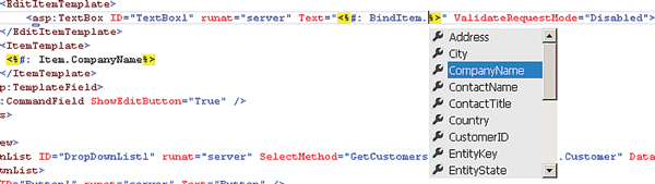
However, if you're expecting your property to return some of the "reserved" HTML characters (for example, "<" or "&" or ">") and you don't want those characters to be treated as HTML, you should add a colon to the delimiter to use <%#: %>. Because it's unusual to return HTML from your object's properties, <%#: %> is actually your safest choice.
The example in Listing 1 binds the GridView to a Customer object using the ItemType attribute. It then binds the GridView's columns to the Customer object's CustomerId property (read-only in all templates) and CompanyName property (updateable in its ItemTemplate). I've used the HTML encoding throughout (after all, the CompanyName might include an ampersand).
Unfortunately, there doesn't seem to be a way to cause the DataView's SmartTag to generate tags using BindItem and Item. You'll need to count on the Visual Studio IntelliSense support to guide you through generating all the tags required to configure a DataView.
Retrieving and Updating Data
To bypass using DataSources to retrieve and update data, you can use the new SelectMethod and UpdateMethod properties on the DataView. In the SelectMethod property, you specify a method in your page that returns a collection of the objects specified in your ItemType. A typical method would look like this:
Public Function GetCustomers() As List(Of Customer)
  Dim custs As List(Of Customer)

  Using nw As New NorthwindEntities()
    custs = (From cust In nw.Customers
              Select cust).ToList
  End Using Return custs End Function
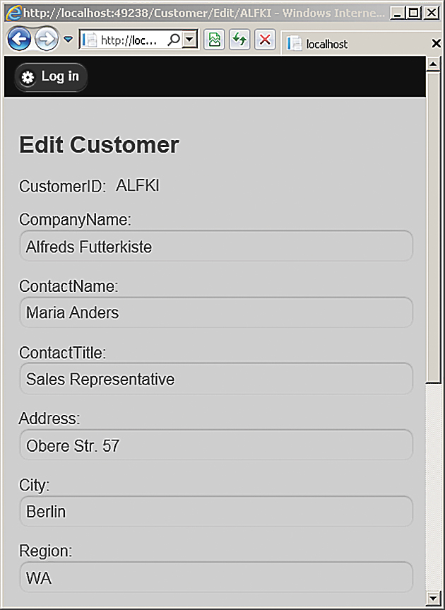
A typical GridView that ties all of these components together would look like this:
<asp:GridView  ID="GridView1"
  runat="server" AutoGenerateColumns="False"
  DataKeyNames="CustomerID"
  ItemType="PHVSite.Customer"
  SelectMethod="GetCustomers"
  UpdateMethod="UpdateCustomer">
You can also use the SelectMethod with display-only controls like the DropDownList. With the DropDownList, you'll also need to specify which properties on the object will be used for the ListItem's Text and Value properties. This example ties a DropDownList to my previous method and specifies that the City property is to be displayed in the list:
<asp:DropDownList ID="DropDownList1" runat="server"
  SelectMethod="GetCustomers" DataTextField="City">
</asp:DropDownList>
While you can use the ItemType with the DropDownList, it doesn't get you much: You can't use Item to bind properties on the object to the control. You'll just have to be careful when you type in the property name.
One last note: You don't need to put all of the code shown here in your .cs or .vb files. The methods in your page referenced by the SelectMethod and UpdateMethod methods can just call a method on some MVC class, passing values from controls on the page. Filtering Data
With DataSources, you can automatically filter your data by tying the DataSource to a control on the page or some other data in the environment just by declaring where the filter values were to come from. You can do that declaratively with your SelectMethod property, too.
If, for instance, you don't like the syntax for accessing cookie values, you can retrieve a named value from the cookies returned to the server and have it passed as a parameter to your SelectMethod by decorating a parameter with the Cookie attribute. When you use the Cookie attribute, you must pass it the name of the cookie you want to retrieve the value from.
The code in Listing 3 ties the method's City parameter to a value from a cookie called CustCity.
On the other hand, if you want to retrieve a value from a DropDownList on your page, your parameter will need to be decorated with the Control attribute. The Control attribute needs to be passed the name of the control:
Public Function GetCustomers(
  <System.Web.ModelBinding.Control("DropDownList1")> City As String)
  As List(Of Customer)
ASP.NET will attempt to do any conversions required to convert the incoming data to your parameter's data type. However, if the incoming data doesn't have an item with a matching name, your method's parameter will be passed Nothing or null. It's a good idea to have your parameter accept a String or some other nullable value (for example, integer? rather than integer).
ASP.NET MVC 4 and Single Page Applications
One big change included in ASP.NET MVC 4 -- and it's a big change for the Microsoft .NET Framework as a whole -- is the new ASP.NET Web API for implementing services. I discuss this in my Practical .NET column, along with the upcoming changes in Windows Communication Foundation (WCF) 4.5 (see "Changes Large and Small: WCF 4.5 and the ASP.NET Web API," ). In this part of the article, I'm going to focus on changes that more directly affect the ASP.NET MVC 4 presentation layer -- which means, as fond as I am of code generation, I won't be looking at its new support for creating code-generation recipes. As you'll see, however, talking about the presentation layer still forces a discussion of the many server-side changes.
The first things you'll notice when creating an ASP.NET MVC 4 application are the three new project templates: Single Page Application, Web API Application and Mobile Application. The templates have much in common. The Login View for all of them, for instance, now uses a jQuery UI to display a model dialog that allows users to register. The default Index View displays general helpful advice to the developer, similar to the default.aspx page in ASP.NET. You also get the same support for HTML5 that Visual Studio provides to ASP.NET.
The Single Page Application, however, is special: it's both a template for a project and a type of Controller that you add to other projects. As a project template, the Single Page Application includes all the script libraries needed to support the paradigm that Web applications are moving toward: the user goes to the server to get a page, stays on that page while having a conversation with a set of services, then goes back to the server to move to the next page. As a project template, the name isn't perfect: a typical application will probably consist of several "single pages" that implement this paradigm.
To support all the JavaScript libraries required, the project template includes a new layout file (_SpaLayout.vbhtml) that references the scripts your Views need. Included in the script libraries that come with the project template is the Knockout library (see John Papa's MSDN Magazine Client Insight column, "Getting Started with Knockout," at bit.ly/xYfE79). Knockout supports implementing the Model-View-ViewModel (MVVM) in the client in order to separate JavaScript logic from presentation logic.
The Microsoft Upshot library (formerly RIA/JS) is also included to provide a single API for integrating both Web and local storage. To support Upshot, the HTMLHelper class has a new method called MetaData that returns the information about the class used with your View that Upshot needs. The method shoves a "JSON-like" description of your class into the page ("JSON-like" because the description includes type information that JSON doesn't provide).
Also provided by default is the History script library, which lets you associate a state in your UI with a URL. This lets you deliver an application that doesn't post back to the server but that the user can still navigate through using the back and forward buttons.
On the server, ASP.NET MVC 4 introduces a new controller type: DataController. The DataController inherits from the ApiController, which is introduced to support the ASP.NET Web API services. The DataController builds on the Web Service capabilities of the ApiController to provide support for business-level infrastructure: transactions, validation and integration with a data-access layer, among other features.
When you add a new controller in Visual Studio 11, the scaffolding options allow you to pick from several different kinds of controllers, including a Single Page Application. In addition, you can also specify a data context class to be used with your controller.
The data context class is intended to provide a single control point for data access; it can be, for instance, an Entity Framework model. If you pick the "new data context" option, Visual Studio creates a class that inherits from the DbContext object -- the starting point for creating a Code First Entity Framework model. And, by the way, adding a Single Page Application controller also adds all of the Views to support basic Create, Read, Update and Delete (CRUD) activity, plus a JavaScript file containing a Knockout MVVM model to which that JavaScript code in the Views binds.
Creating Mobile Applications
For mobile applications, the most obvious change to the basic ASP.NET MVC project structure is the inclusion of the jQuery Mobile 1.0 libraries. The Knockout library is also included, though Upshot and History aren't.
Less obvious are the changes to the default CSS file, which force buttons to the screen width, and the viewport meta tag in the default layout file. Some of Microsoft's documentation suggests that the default CSS file will, eventually, also set CSS media rules for small screens, but that isn't present in the beta. While Visual Studio will work with any number of emulators, these changes mean you can get a good idea of what your mobile Web pages will look like just by resizing your browser window.
Figure 3. Resizing your browser window gives an impression of a Web page in a mobile device without using an emulator.
ASP.NET MVC 4 makes it easier to generate different Views (or partial Views) for mobile devices. If you include the word Mobile in a View name, it will automatically be selected if a mobile device requests your View in place of another View with the same name that doesn't contain the word "Mobile." So, if you generate two Views with the names Customer.vbhtml and Custom-er.Mobile.vbhtml, the Customer.vbhtml View is automatically delivered to desktop browsers while the Customer.Mobile.vbhtml is delivered to mobile devices. The same convention applies to layout and partial Views: include Mobile in the layout or View's name and it will be selected automatically if the client is a mobile device.
This isn't bad, but isn't necessarily optimal, either -- it's not clear that, for instance, a tablet needs to or should have the same View as a smartphone, even though both are mobile devices. To support different Views for different mobile devices, you can create new display modes that are tied to specific devices.
You must first define the conditions when the display mode applies in your global.asax file's Application_Start event. After adding an Imports or using statement for System.Web.WebPages, code like this adds a new DefaultDisplayMode (called iTab) with a ContextCondition that checks to see if the user agent's name contains the stringiTab:
DisplayModeProvider.Instance.Modes.Insert(0,
             New DefaultDisplayMode("iTab") _
  With {
         .ContextCondition = (Function(context) _
          context.GetOverriddenUserAgent().IndexOf("iTab",
            StringComparison.OrdinalIgnoreCase) >= 0)
        })
When the lambda expression in the ContextCondition returns true, ASP.NET MVC 4 will automatically select Views, layouts and partial Views that contain the word iPad in their names. You can also implement View switching by overriding the user agent information provided by the client, and treating the client as a specific browser. This allows you to provide the user with the option of treating his device as if it were, for instance, a desktop browser instead of a smartphone or tablet.
Installing the jQuery.Mobile.MVC package provides the infrastructure to implement this feature, including a partial View, a layout and a controller. You'll need to add the necessary display modes and incorporate the partial View into your Views.
To Upgrade or Not to Upgrade?
There's a lot to like in both upgrades. I have some items on my wish list that still aren't fulfilled (a site map editor would be nice, for instance). I also wish that the ASP.NET MVC templates didn't send just the structure of the HTML page and then immediately issue an AJAX request for the data. Other than potentially reducing some of the HTML sent to the client when there's a ton of repeated data, there's no good reason why the initial page couldn't satisfy the user's request by including the data. After that initial display, service requests would take care of updates to the UI -- but that's why we have programmers, isn't it?
Overall, though, ASP.NET MVC makes life easier for mobile developers (well, if mobile development is ever easy), and both platforms enhance their support for integrating with data stores. While there might be nothing groundbreaking here, both versions are worth upgrading to. If you're building mobile applications, you need ASP.NET MVC 4; if you want to get support for HTML5, move to the new client-side paradigm or integrate with an Object Relation Mapping tool, both upgrades will make you more productive.
Originally from http://visualstudiomagazine.com/Articles/2012/05/01/ASPNET-Test-Drive.aspx?Page=1
All examples can be seen from this link.
Wednesday, 16 May 2012
How to add HTML5 Drag and Drop to SharePoint Lists
Microsoft SharePoint is an enterprise platform with a long history and vast variety of features, which is why it can’t always react quickly enough to follow emerging Web technology trends. Despite a wide enterprise adoption of SharePoint and a huge effort to provide a broad number of features, SharePoint still lags behind modern CMS products in terms of immersive UIs, such as HTML5 and CSS3.
In my opinion, HTML5 is not only a hot new technology, but it truly has many practical benefits: it’s easy, convenient and rich—and it’s supported, more or less, by all the modern browsers (including mobile device browsers). Additionally, HTML5 and JavaScript are becoming major technologies for desktop programming in Windows.
So HTML5 definitely deserves its place in SharePoint to make portals much easier to use. And improving SharePoint interfaces can really help business users by enabling them to work better and faster.
Unfortunately, SharePoint doesn’t have any built-in HTML5 goodness, but what it does have is great flexibility. In this article, I’m going to demonstrate how easy it is to add HTML5 drag-and-drop support to SharePoint—and how smooth it can make the standard interface, as shown in Figure 1.
.png "Drag and Drop in SharePoint")
Figure 1 Drag and Drop in SharePoint
To implement this, I’ll use one of the essential SharePoint building blocks, which is also one of my favorite SharePoint tools—the XsltListViewWebPart and its XSL transformations (see the MSDN Library page at bit.ly/wZVSFx for details).
In my opinion, HTML5 is not only a hot new technology, but it truly has many practical benefits: it’s easy, convenient and rich—and it’s supported, more or less, by all the modern browsers (including mobile device browsers). Additionally, HTML5 and JavaScript are becoming major technologies for desktop programming in Windows.
So HTML5 definitely deserves its place in SharePoint to make portals much easier to use. And improving SharePoint interfaces can really help business users by enabling them to work better and faster.
Unfortunately, SharePoint doesn’t have any built-in HTML5 goodness, but what it does have is great flexibility. In this article, I’m going to demonstrate how easy it is to add HTML5 drag-and-drop support to SharePoint—and how smooth it can make the standard interface, as shown in Figure 1.
Figure 1 Drag and Drop in SharePoint
To implement this, I’ll use one of the essential SharePoint building blocks, which is also one of my favorite SharePoint tools—the XsltListViewWebPart and its XSL transformations (see the MSDN Library page at bit.ly/wZVSFx for details).
Why Not a Custom Web Part?
As always, when it comes to implementation, SharePoint offers a wide range of possibilities, and it’s exceedingly important to pick the one that will serve you best.
For the HTML5 drag-and-drop challenge, considering that drag and drop is mainly for managing data, many SharePoint developers would probably prefer to build a custom Web Part, which in this case acts just like an ordinary ASP.NET control: the data is stored in a standard SharePoint list, retrieved through the object model or SPDataSource control, and rendered with the help of ASCX markup and ASP.NET controls.
Simple, clear, plain ... but the best choice?
Two years ago I thought so. Today, I’d prefer to customize XsltListViewWebPart using its XSL transformations. Why did I change my mind?
Starting with SharePoint 2010, almost all kinds of list views (with the single exception of Calendars) are displayed through this very Web Part. Just imagine: all these data types, all these different views and styles and list types, all this great variety of data is rendered using XsltListViewWebPart and its XSL transformations. It’s a flexible and powerful tool.
If you decide to jump in and build your own custom Web Part to render some HTML5 markup for displaying list data, you’ll lose all of the built-in features. And based on my experience, that’s a huge loss. By the way, I haven’t seen a single custom Web Part yet that didn’t, at the very least, end up implementing half of the out-of-the-box XsltListViewWebPart features.
So, my plan is to reuse existing functionality rather than create a similar custom Web Part that would probably be much worse in terms of flexibility and power.
In fact, XsltListViewWebPart includes a bunch of useful features. It’s integrated into SharePoint Designer, it supports all possible Web Part connections and it displays all the SharePoint data types properly. It supports grouping, subtotals, paging, item context menus, inline editing, item selections, presence indicators and more. It has a contextual Ribbon interface, provides a UI for sorting and filtering, offers some basic view styles and more again. In sum, XsltListViewWebPart has a great many useful features that would be very hard to re-implement using the custom Web Part approach.
XsltListViewWebPart
XsltListViewWebPart provides many integration points for developers: a programmatic interface, a CAML interface and, of course, XSL transformations in conjunction with parameter bindings. And don’t forget, all these objects and properties also have their representations in the Client Object Model, so you can access your XsltListViewWebPart even from JavaScript or Silverlight.
So, XsltListViewWebPart is really a powerful tool. True, all this SharePoint-specific XML (or XSLT) looks a bit scary at initial glance, but there are some “life hacks” I’m going to show you that will help you puzzle it out.
So, XsltListViewWebPart is really a powerful tool. True, all this SharePoint-specific XML (or XSLT) looks a bit scary at initial glance, but there are some “life hacks” I’m going to show you that will help you puzzle it out.
The Scenario
Before I dive into the implementation details, let me describe the overall scenario.
What I’m going to do is inject HTML5 drag and drop into SharePoint list views to enable users to drag cells from one list to another list. My example will use a Tasks list and an Executors list, so the Project Manager can easily assign and reassign tasks, dragging executors to corresponding Tasks list cells.
As you might know, HTML5 introduces several new attributes for drag and drop, the most important of which is the “draggable” attribute. There are also a number of events for handling various stages of the drag-and-drop process. Handler functions for these events can be attached using corresponding attributes, such as “ondragstart,” “ondragend” and so forth. (For details, read the World Wide Web Consortium [W3C] HTML5 specification draft, Chapter 7.6, at bit.ly/lNL0FO.)
For my example, this means I just need to use XSLT to add some basic attributes to certain list view cells, and probably some additional custom attributes to attach the data values (that will be conveyed by dragging). Eventually, I’ll need to provide the corresponding JavaScript code for the handler functions.
First Steps
I need two lists. I can create a Tasks list from the standard Tasks template, or I can just create a custom list and add some columns, including an obligatory “Assigned To” site column. I create a second list, Executors, as a custom list, adding “Executor” as a column of type “Person or group,” making it required, indexed and unique.
The Executors list should display only user names; thus it doesn’t actually need the standard “Title” column. To hide this column, I go to list settings, enable management of content types, then go to the “Item” content type, click on the “Title” column and make the column hidden, as shown in Figure 2.
.png "Making the Title Column Hidden in SharePoint List Settings")
Figure 2 Making the Title Column Hidden in SharePoint List Settings
I filled these lists with sample data and then created a Web Part page for my dashboard, where I added these lists side-by-side (Tasks on the left and Executors on the right), as shown in Figure 3.
.png "Adding the Lists to the SharePoint Dashboard")
Figure 3 Adding the Lists to the SharePoint Dashboard
OK, now I have the lists and I have the data. Now it’s time for the actual implementation of the drag-and-drop functionality.
The Executors list should display only user names; thus it doesn’t actually need the standard “Title” column. To hide this column, I go to list settings, enable management of content types, then go to the “Item” content type, click on the “Title” column and make the column hidden, as shown in Figure 2.
Figure 2 Making the Title Column Hidden in SharePoint List Settings
I filled these lists with sample data and then created a Web Part page for my dashboard, where I added these lists side-by-side (Tasks on the left and Executors on the right), as shown in Figure 3.
Figure 3 Adding the Lists to the SharePoint Dashboard
OK, now I have the lists and I have the data. Now it’s time for the actual implementation of the drag-and-drop functionality.
SharePoint Designer
Microsoft SharePoint Designer is a completely free tool for rapid development of SharePoint applications. SharePoint 2010 is greatly improved as compared with SharePoint 2007, and now it’s exceedingly useful, even for developers. The idea is that you can use the SharePoint Designer GUI to generate some really complex XSLT code and then just copy and paste the generated code into your Visual Studio project instead of writing the typo-prone and not always well-documented XML/XSLT by hand. I often use this trick in real-world projects and, I promise you, it saves plenty of time.
I open SharePoint Designer and navigate to the dashboard page I created earlier. I select a cell in the Assigned To column (right-click and choose Select | Cell). Now, the magic: in the status bar, I see the path to the XSL template (and to the corresponding HTML tag within this template) that’s responsible for displaying this particular cell (see Figure 4).
.png "The Path to the Current XSL Template in SharePoint Designer")
Figure 4 The Path to the Current XSL Template in SharePoint Designer
This information can be very useful for determining which XSL template to override in order to change the cell markup. You can find the original code for the templates in the 14/TEMPLATE/LAYOUTS/XSL folder, and use it in your own XSLT files or in the <Xsl> tag of the XsltListViewWebPart.
But I don’t need to deal with these huge and complicated XSLT files to achieve my goal. Instead, I can use the SharePoint Designer conditional formatting feature, which is designed to highlight certain rows or cells with special formatting, based on particular conditions. You don’t need any special skills to use this feature; the GUI makes it easy. But behind the scenes, it’s all implemented with XSLT. Thus, SharePoint Designer includes a kind of ready-to-use graphical XSLT generator, and I’m going to use it now for my own needs.
I select a cell, click the Conditional Formatting button on the Ribbon and then select Format Column, as shown in Figure 5.
.png "Setting Conditional Formatting in SharePoint Designer")
Figure 5 Setting Conditional Formatting in SharePoint Designer
Next, I create an unlikely condition, ID equal to zero, as shown in Figure 6.
.png "The Conditional Formatting Dialog in SharePoint Designer")
Figure 6 The Conditional Formatting Dialog in SharePoint Designer
Then I click the Set Style button and select some random style (such as “text-decoration: underline”). I press OK and switch to the Code View tab, where I locate the generated code; it is, of course, inside the <Xsl> tag of the XsltListViewWebPart control.
I open SharePoint Designer and navigate to the dashboard page I created earlier. I select a cell in the Assigned To column (right-click and choose Select | Cell). Now, the magic: in the status bar, I see the path to the XSL template (and to the corresponding HTML tag within this template) that’s responsible for displaying this particular cell (see Figure 4).
Figure 4 The Path to the Current XSL Template in SharePoint Designer
This information can be very useful for determining which XSL template to override in order to change the cell markup. You can find the original code for the templates in the 14/TEMPLATE/LAYOUTS/XSL folder, and use it in your own XSLT files or in the <Xsl> tag of the XsltListViewWebPart.
But I don’t need to deal with these huge and complicated XSLT files to achieve my goal. Instead, I can use the SharePoint Designer conditional formatting feature, which is designed to highlight certain rows or cells with special formatting, based on particular conditions. You don’t need any special skills to use this feature; the GUI makes it easy. But behind the scenes, it’s all implemented with XSLT. Thus, SharePoint Designer includes a kind of ready-to-use graphical XSLT generator, and I’m going to use it now for my own needs.
I select a cell, click the Conditional Formatting button on the Ribbon and then select Format Column, as shown in Figure 5.
Figure 5 Setting Conditional Formatting in SharePoint Designer
Next, I create an unlikely condition, ID equal to zero, as shown in Figure 6.
Figure 6 The Conditional Formatting Dialog in SharePoint Designer
Then I click the Set Style button and select some random style (such as “text-decoration: underline”). I press OK and switch to the Code View tab, where I locate the generated code; it is, of course, inside the <Xsl> tag of the XsltListViewWebPart control.
XSL Transformations
Now I’m ready to modify the markup of “Assigned To” cells. The “Assigned To” column is the “data acceptor” where I’ll drag executors, so I need to provide the “ondragover,” “ondragenter,” “ondragleave” and “ondrop” attributes, which will point to the corresponding JavaScript event handler functions.
The code generated by SharePoint Designer in the previous paragraph contains the XSL template with the following signature:
The code generated by SharePoint Designer in the previous paragraph contains the XSL template with the following signature:
<xsl:template name="FieldRef_printTableCell_EcbAllowed.AssignedTo"
  match="FieldRef[@Name='AssignedTo']" mode="printTableCellEcbAllowed"
  ddwrt:dvt_mode="body" ddwrt:ghost="" xmlns:ddwrt2="urn:frontpage:internal">
As you might know, XSL templates can call each other, either by name or by condition. The first type of call is performed using the “xsl:call-template” element, and it’s very similar to a function call—such as what you’d use in C#, for example.
The second option is preferable and much more flexible: by using the “xsl:apply-templates” element, you can specify the mode and the parameter (which is selected using XPath so it can actually contain many elements), without specifying any particular template name. For each parameter element, the corresponding template will be matched using the “match” attribute. You can think of this approach as something similar to overloads in C#.
As you can see in the preceding code, this template will match “FieldRef” elements, where the Name attribute is equal to “AssignedTo.” Also, the “mode” attribute of the corresponding xsl:apply-template call must be equal to “printTableCellEcbAllowed.” So this template is essentially an overload for the standard function that displays fields’ values. And this overload will match only the “Assigned To” field values.
Now let’s take a look at what’s inside this template, as shown in Figure 7 (some code was removed for clarity).
Figure 7 Inside the XSL Template
<xsl:template match="FieldRef[@Name='AssignedTo']" mode="printTableCellEcbAllowed" ...>
  <xsl:param name="thisNode" select="."/>
  <xsl:param name="class" />
  <td>
    <xsl:attribute name="style">
      <!-- ... -->
    </xsl:attribute>
    <xsl:if test="@ClassInfo='Menu' or @ListItemMenu='TRUE'">
      <xsl:attribute name="height">100%</xsl:attribute>
      <xsl:attribute name="onmouseover">OnChildItem(this)</xsl:attribute>
    </xsl:if>
    <xsl:attribute name="class">
      <!-- ... -->
    </xsl:attribute>
    <xsl:apply-templates select="." mode="PrintFieldWithECB">
      <xsl:with-param name="thisNode" select="$thisNode"/>
    </xsl:apply-templates>
  </td>
</xsl:template>
As you see, the template contains two xsl:param elements, one <td> element, several xsl:attribute elements and an xsl:apply-templates element, which will cause some lower-level templates to be applied.
To achieve my drag-and-drop goal, I just add the drag-and-drop attributes to the <td> element, like so:
To achieve my drag-and-drop goal, I just add the drag-and-drop attributes to the <td> element, like so:
- <td ondragover="return UserDragOver(event, this)" ondragenter=
- "return UserDragOver(event, this)" ondragleave=
- "UserDragLeave(event, this)" ondrop="UserDrop(event, this)">
Pretty simple, isn’t it?
Alternatively, if you have jQuery deployed in your SharePoint environment, you might consider attaching JavaScript event handlers using the jQuery .on method.
The markup for the Assigned To column is ready (I’ll write the handlers a bit later). Now it’s time to customize the Executors list.
I switch back to the Design View tab, select a cell in the Executors column and repeat the conditional formatting trick for generating the XSLT code. Then I add the onstartdrag attribute to ensure that the drag and drop can properly start (I don’t need the draggable attribute here, because “Person or Group” field values are rendered as links and, according to the specification, links have the draggable attribute set to “true” by default):
- <td ondragstart="UserDragStart(event, this)">
Cool. But how will I track the data? How do I determine which executor is being dragged? Obviously, I need his login name or, better, his ID. Parsing the ID from inside the TD element is unreasonably complicated, in my opinion.
The point here is that in XSLT, for any field of type Person or Group, the user ID is available and can be easily retrieved with a simple XPath query.
In this query, I need to point to the current element’s values. The current element is usually referenced as the $thisNode parameter in all standard XsltListViewWebPart templates. To retrieve the user’s ID, you point to the attribute of the $thisNode parameter, with name equal to the name of the Person or Group column, with “.id” concatenated to its end.
So here’s my query:
- <td ondragstart="UserDragStart(event, {$thisNode/Executor.id}, this)">
The curly brackets are used for including the XPath expression right in the attribute value.
The markup is ready and can actually be used right away, but it would probably be a good idea to work with this code a little more to make it more reusable.
Making Templates Reusable
You might have noticed that the templates are tightly bound to specific column names and that these templates are intended only for particular lists. But it’s actually very simple to modify these templates so you can reuse them for other lists with other column names.
To start, if you examine the template signature I presented earlier, you’ll see the following attribute:
To start, if you examine the template signature I presented earlier, you’ll see the following attribute:
match="FieldRef[@Name='AssignedTo']"Obviously, this binds the template to the Assigned To column. To make this template a bit broader-based, you can replace the name binding with a type binding, so that any Person or Group column will match. So be it! Here’s the code:
match="FieldRef[@Type='User']"The same modification should be applied to the second template, where the FieldRef element is matched to the “Executor” field internal name.
Now, because I can have any column of type Person or Group and any list, I need to pass some additional information to my JavaScript handlers. When drag and drop is performed, I need to update the value of the Assigned To column in the Tasks list, so I need to know the name of the column and GUID of the list.
As I mentioned previously, SharePoint XSLT has some standard parameters that are available globally. One such parameter is $List, which stores the current list’s GUID. And the internal name of the field can be easily retrieved from the matched FieldRef element.
So, I’m going to pass the list GUID and the column internal name to the UserDrop handler, as follows (I’m omitting the “ondragenter,” “ondragover” and “ondragleave” attributes for clarity):
- <td ... ondrop="UserDrop(event, this, '{$List}', '{./@Name}'">
The “.” points to the current FieldRef element (which was matched previously by the template).
Next, I need to get rid of the “Executor” string in the id parameter in the Executors list XSLT using the following code:
Next, I need to get rid of the “Executor” string in the id parameter in the Executors list XSLT using the following code:
- <td ondragstart
- ="UserDragStart(event, {$thisNode/@*[name()=
- concat(current()/@Name, '.id')]}, this)">
The templates are now ready and reusable, and now I’m going to write the corresponding JavaScript code to implement the handlers.
Writing JavaScript Handlers
Although there are four different handlers to write, most of them are primitive and they’re all rather obvious.
Usually I’d recommend placing this code in a separate JavaScript file. And it generally would be a good idea to use Visual Studio to create it, as you’d get the benefit of IntelliSense there. In some circumstances, however, it’s reasonable to put this code inside the XSLT, overriding the root template (match=“/”) for this purpose. This lets you use some XSLT variables and parameters inside your JavaScript code and it also means you don’t have to be concerned about deploying JavaScript files.
So let’s look at the code for the handlers—DragStart, DragEnter, DragOver, DragLeave and Drop.
In the UserDragStart handler, you need to initialize the data transfer. This means you need to store dragged data in a special HTML5 DataTransfer object, like this:
- function UserDragStart(e, id, element) {
- e.dataTransfer.effectAllowed = 'copy';
- e.dataTransfer.setData('Text', id + '|' + element.innerHTML);
- }
Note that the ID of the user is not the only part of the data that’s transferred. I also added the inner HTML of the <td> element, to avoid having to refresh the page after dropping the data (see the UserDrop handler code in Figure 8 for the details).
Figure 8 The Drop Event Handler
- function UserDrop(e, toElement, listGuid, columnName) {
- // Terminate the event processing
- if (e.stopPropagation)
- e.stopPropagation();
- // Prevent default browser action
- if (e.preventDefault)
- e.preventDefault();
- // Remove styles from the placeholder
- toElement.style.backgroundColor = '';
- //toElement.className = '';
- // iid attribute is attached to tr element by SharePoint
- // and contains ID of the current element
- var elementId = toElement.parentNode.getAttribute('iid').split(',')[1];
- // Transferred data
- var data = e.dataTransfer.getData('Text');
- var userId = data.split('|')[0];
- var userLinkHtml = data.split('|')[1];
- // Setting value of the field using SharePoint
- // EcmaScript Client Object Model
- var ctx = new SP.ClientContext.get_current();
- var list = ctx.get_web().get_lists().getById(listGuid);
- var item = list.getItemById(elementId);
- item.set_item(columnName, userId);
- item.update();
- // Asynchronous call
- ctx.executeQueryAsync(
- function () { toElement.innerHTML = userLinkHtml; },
- function (sender, args) { alert('Drag-and-drop failed.
- Message: ' + args.get_message()) }
- );
- return false;
- }
For the DragEnter and DragOver events in this case, the handlers are identical so I’m using a single function for them. You should indicate in these events that the user can drop his data here. According to the specification, for this purpose you should call the event.preventDefault method (if available), and then return false.
The DragEnter/DragOver handler is the perfect place to apply custom styles to the drag-and-drop placeholder to notify the user that he actually can drop his dragged data. To simplify the example, I’ll use inline CSS styles, but in a real-world project I’d recommend using CSS classes (see the commented lines shown in Figure 9).
Figure 9 The DragOver and DragLeave Event Handlers
- function UserDragOver(e, toElement) {
- // Highlight the placeholder
- toElement.style.backgroundColor = '#efe';
- // toElement.className = 'userDragOver';
- // Denote the ability to drop
- if (e.preventDefault)
- e.preventDefault();
- e.dataTransfer.dropEffect = 'copy';
- return false;
- }
- function UserDragLeave(e, toElement) {
- // Remove styles
- toElement.style.backgroundColor = '';
- // toElement.className = '';
Obviously, in DragLeave I need to remove the previously applied styles, as shown in Figure 9.
During the Drop event in Figure 8, two important actions need to be performed:
- Apply the changes. Using the SharePoint EcmaScript Client Object Model, set the field value to the transferred user ID.
- Replace the inner HTML code in the current cell (TD) with code from the transferred one to make the changes appear without refreshing the page.
The simplest way here is to customize the master page file using SharePoint Designer, as it doesn’t require any special skills. But because you’re a developer, chances are you’d prefer to gather together all these JavaScript and XSLT customizations and create a deployable solution. OK, let’s do it!
Building a Deployable Solution
To create a ready-to-use solution you can send to your customers, you need to perform some very simple steps:- Open Visual Studio and create an Empty SharePoint Project. Then select “deploy as a farm solution” in the project settings dialog.
- Add a SharePoint “Layouts” Mapped Folder to your project, and add three new files to it: UserDragHandlers.js, UserDragProvider.xsl and UserDragConsumer.xsl.
- Paste the previously created JavaScript code and the XSLT code (generated in SharePoint Designer) into corresponding files.
- Add an Empty Element project item, open Elements.xml and paste the following code there:
<CustomAction ScriptSrc="/_layouts/SPDragAndDrop/UserDragHandlers.js" Location="ScriptLink" Sequence="10" />
This will deploy the link to your JavaScript file to all site pages. - Finally, add an Event Receiver to Feature1 (which was created automatically when you added the Empty Element project item), uncomment the FeatureActivated method and paste the following code in it:
- var web = properties.Feature.Parent as SPWeb;
- SPList list;
- SPView view;
- list = web.Lists["Tasks"];
- view = list.DefaultView;
- view.XslLink = "../SPDragAndDrop/UserDragConsumer.xsl";
- view.Update();
- list = web.Lists["Executors"];
- view = list.DefaultView;
- view.XslLink = "../SPDragAndDrop/UserDragProvider.xsl";
- view.Update();
And, yes, that’s all—you’re done! Pretty simple, isn’t it? Now if you build and deploy the solution with the Tasks and Executors lists created previously, and then create a dashboard containing default views of each of them, your dashboard will sport a handy drag-and-drop feature.
Browser Support
By now, just about all of the major browsers except Opera support HTML5 drag and drop. I’ve tested Internet Explorer 9.0.8112.16421, Chrome 16.0.912.75 and Firefox 3.6.12, and they’re all fully compatible with the described solution. I expect that some older versions of these browsers will work too. Actually, Safari should also work, but as of this writing, it has some strange bugs in its HTML5 drag-and-drop implementation that prevent the solution from working as expected.What’s Next?
In my solution, neither the XSLT templates nor the JavaScript contain any list-specific code—no hardcoded GUIDs, names, titles or anything like that. So, these transformations could potentially be applied to any lists or document libraries, and you could add drag-and-drop support to any column of type Person or Group. Isn’t that cool?Obviously, other types of columns can be made draggable the same way, so you could, in fact, make a solution in which all cells in all SharePoint lists are draggable, and in dashboard pages users would then be able to drag cells between lists, which is also handy.
A very interesting challenge might be implementing by-row drag and drop. The idea is essentially the same, but to get the proper template, you should use row conditional formatting. This could be used to link lists elements or, for example, to change their order. You could, for instance, make a “Recycle Bin” link from the quick-launch menu work as a drag-and-drop acceptor, and use it as a cool way to delete items from lists.
There’s so much you can do. Just think, experiment and try—your SharePoint portal will become a much friendlier place.
Originally from Andrey Markeev a SharePoint Server MVP who works as a SharePoint developer at Softline Group in Russia
Subscribe to:
Posts (Atom)