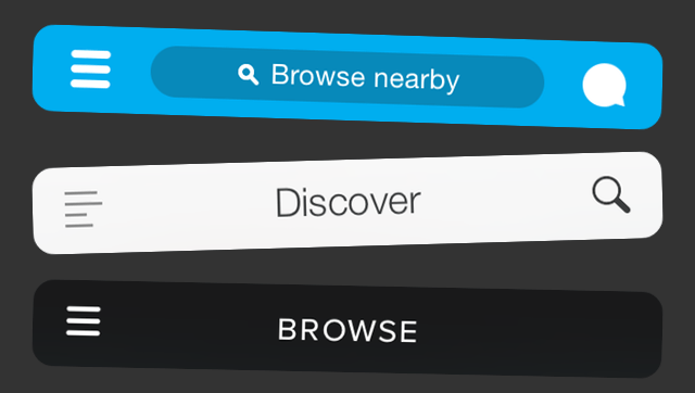
That little three-lined button is the devil. Whether you call it a side menu, navigation drawer, or a hamburger, hiding your features off-screen behind a nondescript icon in the corner is usually a poor mobile design choice. Interaction theory, A/B tests, and the evolution of some of the top apps in the world all support the same thesis: The hamburger button is bad for engagement, and you should probably replace it with a tab bar or other navigation scheme.
Even if you’re not a designer, I highly recommend reading
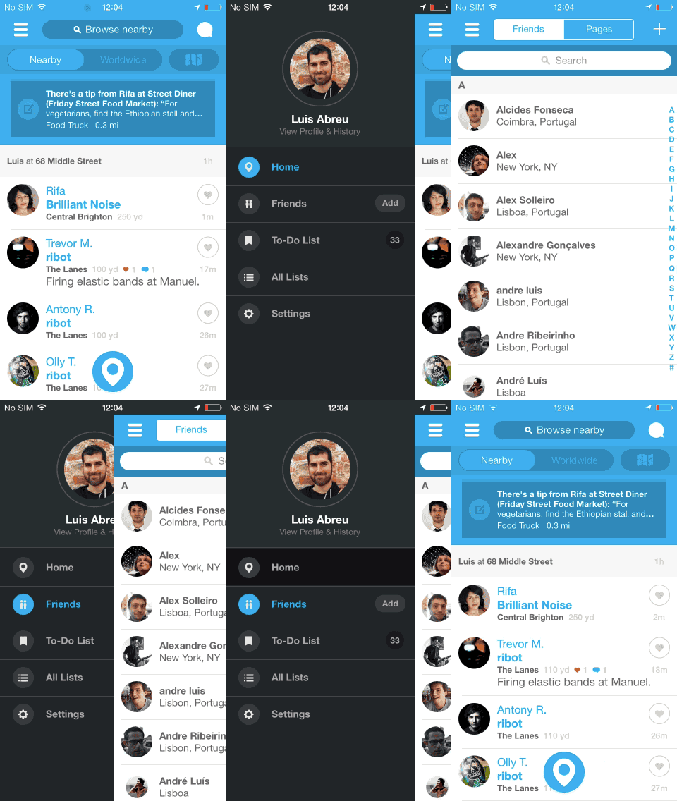
Luis Abreu’s brilliant, GIF-filled deep-dive:
Why And How To Avoid Hamburger Menus. Here’s the summary of his analysis
plus several other studies and some context about how this is playing out across the most popular apps. There’s debate about web hamburgers, but I’m focusing on mobile with iOS as the examples, and much of this applies to Android.
Essentially, what’s out of sight is out of mind. Any navigation options you hide behind the hamburger will be forgotten, or at least used a lot less. It doesn’t help that the button is often placed in the top left corner — the hardest place to reach when using the phone with just your right hand.
Hamburger buttons are less efficient, since you have to tap once before you’re even allowed to see the option you want. They clash with the navigation patterns of many mobile apps, forcing you to swipe or ‘back’ through multiple screens just to arrive at the hamburger button. And they’re less glanceable, preventing you from seeing notifications about specific areas of an app such as notifications, messages, or new content without first opening the side menu.
Yet despite these shortcomings, many apps still use the hamburger because it’s an easy way to cram a ton of functionality into an app. They’re especially tempting if you’re trying to translate a full-featured web app into a mobile one. But in the end, they obscure what’s special about your product.
One Solution: The Tab Bar.
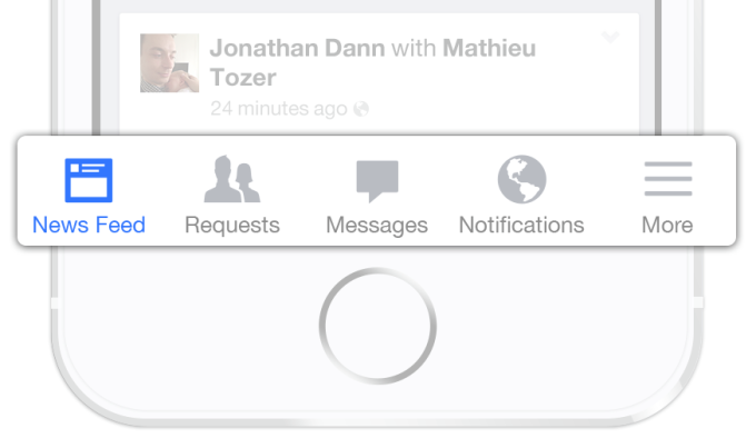
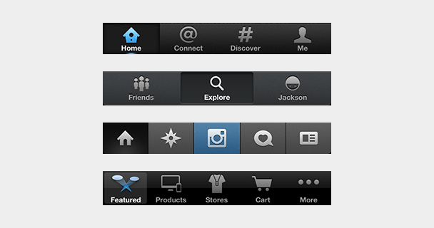
The tab bar is a row of persistently visible buttons typically at the bottom of the screen that open different parts of the app.
Instead of hiding the navigation options in a drawer, you splay them out. This keeps users from forgetting they exist, makes multiple pieces of core functionality available with one tap, allows rapid switching between features without the need to retreat to the app’s homescreen, and lets you display notifications on each tab.
What you sacrifice is a bit of screen real estate, but it’s probably worth it. An A/B test by mobile app
zeebox presented by The Next Web show just how damaging these drawbacks can be to an app’s engagement rate. Six months ago zeebox tried switching from a tab bar to a hamburger, and saw its metrics drop. Recently, it ran a simultaneous A/B test on the two navigation schemes and found
the tab bar drove a 55 percent average weekly frequency of use, and an 8.7 percent higher average daily frequency.
There are also clever ways to make the tab bar disappear when it’s not in use. If the home screen is a scrolling feed, the tab bar can be hidden when people flick it up to unfurl new content, and revealed if they start pulling down trying to get back to the top. In an interface like a map where maximizing screen real estate is key, the tab bar can be hidden when a user taps or drags. It’s not perfect for all situations, but many information architectures are better conveyed this way.
Why It’s Time To Evolve
Users seem to want single-purpose mobile apps that nail a specific use case quickly. That’s why we’re in the midst of “The Great Unbundling Of 2014″. Big, bloated apps are trying to slim down and speed up by pushing some functionality into standalone or companion apps.
Facebook’s Messenger and
Foursquare’s Swarm are two prime examples.
But if the goal is unburying core features so they’re more prominent and easily accessible, ditching the hamburger button is a wise move. When Facebook launched Messenger, it was still using a hamburger button. Luckily with the shift to iOS 7,
Facebook switched to a tab bar after a ton of testing showed it was the way to go.

Left: Facebook’s old hamburger button navigation. Right: The new tab bar style
Facebook has more features than it can fit in five buttons along the bottom, so it still uses the last tab bar space to house a “More” hamburger revealing your profile, events, groups, and more. But that’s a much better compromise. A horizontal-scrolling tab bar with more tabs than fit on-screen is another option.
Other popular apps sporting tab bars on iOS include Twitter, Instagram, Pinterest, Uber, Skype, WordPress, Quora, and the App Store. Many of them used to be saddled with hamburgers but came to their senses. Gmail, Google Maps, Pocket, TechCrunch’s own app, and many more still use the dreaded icon
Norm Cox invented for Xerox around 1981.
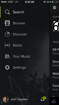
Occasionally, if an app is pretty much single-purpose already, hiding truly extraneous features in a sidebar can make sense. Take Lyft, where mostly you’re just booking a car, and very rarely need to visit your profile, payment info, or send invitations. But Spotify is shooting itself in the foot by hiding its important Browse, Discover, Radio, Playlists, and Inbox behind the hamburger.
So do it for your engineers, who work too hard building features for you to stuff them in the closet. Do it for your business team, which needs the engagement you lose because people don’t even remember what your app offers. But most of all, do it for your users. They downloaded your app because they had problems. Don’t banish the solutions to a side menu.