Wednesday, 28 May 2014

Kill The Hamburger Button


That little three-lined button is the devil. Whether you call it a side menu, navigation drawer, or a hamburger, hiding your features off-screen behind a nondescript icon in the corner is usually a poor mobile design choice. Interaction theory, A/B tests, and the evolution of some of the top apps in the world all support the same thesis: The hamburger button is bad for engagement, and you should probably replace it with a tab bar or other navigation scheme.
Even if you’re not a designer, I highly recommend reading Luis Abreu’s brilliant, GIF-filled deep-dive: Why And How To Avoid Hamburger Menus. Here’s the summary of his analysis plus several other studies and some context about how this is playing out across the most popular apps. There’s debate about web hamburgers, but I’m focusing on mobile with iOS as the examples, and much of this applies to Android.
burgerception-9e394612
Essentially, what’s out of sight is out of mind. Any navigation options you hide behind the hamburger will be forgotten, or at least used a lot less. It doesn’t help that the button is often placed in the top left corner — the hardest place to reach when using the phone with just your right hand.
Hamburger buttons are less efficient, since you have to tap once before you’re even allowed to see the option you want. They clash with the navigation patterns of many mobile apps, forcing you to swipe or ‘back’ through multiple screens just to arrive at the hamburger button. And they’re less glanceable, preventing you from seeing notifications about specific areas of an app such as notifications, messages, or new content without first opening the side menu.
foursquare-menu-aa8caf50
Yet despite these shortcomings, many apps still use the hamburger because it’s an easy way to cram a ton of functionality into an app. They’re especially tempting if you’re trying to translate a full-featured web app into a mobile one. But in the end, they obscure what’s special about your product.

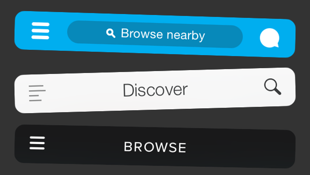
One Solution: The Tab Bar.

The tab bar is a row of persistently visible buttons typically at the bottom of the screen that open different parts of the app.
facebook-tab-bar1

Instead of hiding the navigation options in a drawer, you splay them out. This keeps users from forgetting they exist, makes multiple pieces of core functionality available with one tap, allows rapid switching between features without the need to retreat to the app’s homescreen, and lets you display notifications on each tab.
What you sacrifice is a bit of screen real estate, but it’s probably worth it. An A/B test by mobile app zeebox presented by The Next Web show just how damaging these drawbacks can be to an app’s engagement rate. Six months ago zeebox tried switching from a tab bar to a hamburger, and saw its metrics drop. Recently, it ran a simultaneous A/B test on the two navigation schemes and found the tab bar drove a 55 percent average weekly frequency of use, and an 8.7 percent higher average daily frequency.
HamburgersAndBasements-TabBars
There are also clever ways to make the tab bar disappear when it’s not in use. If the home screen is a scrolling feed, the tab bar can be hidden when people flick it up to unfurl new content, and revealed if they start pulling down trying to get back to the top. In an interface like a map where maximizing screen real estate is key, the tab bar can be hidden when a user taps or drags. It’s not perfect for all situations, but many information architectures are better conveyed this way.

Why It’s Time To Evolve

Users seem to want single-purpose mobile apps that nail a specific use case quickly. That’s why we’re in the midst of “The Great Unbundling Of 2014″. Big, bloated apps are trying to slim down and speed up by pushing some functionality into standalone or companion apps. Facebook’s Messenger and Foursquare’s Swarm are two prime examples.
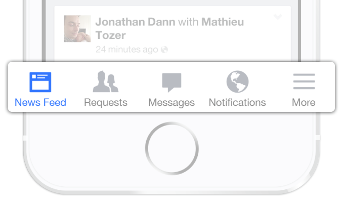
But if the goal is unburying core features so they’re more prominent and easily accessible, ditching the hamburger button is a wise move. When Facebook launched Messenger, it was still using a hamburger button. Luckily with the shift to iOS 7, Facebook switched to a tab bar after a ton of testing showed it was the way to go.
facebook-ios-7
Left: Facebook’s old hamburger button navigation. Right: The new tab bar style
Facebook has more features than it can fit in five buttons along the bottom, so it still uses the last tab bar space to house a “More” hamburger revealing your profile, events, groups, and more. But that’s a much better compromise. A horizontal-scrolling tab bar with more tabs than fit on-screen is another option.
photo (6)
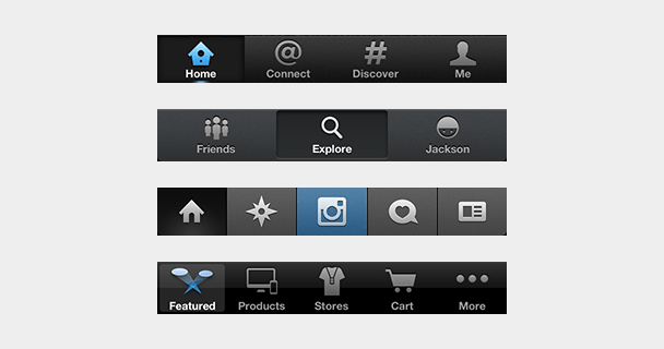
Other popular apps sporting tab bars on iOS include Twitter, Instagram, Pinterest, Uber, Skype, WordPress, Quora, and the App Store. Many of them used to be saddled with hamburgers but came to their senses. Gmail, Google Maps, Pocket, TechCrunch’s own app, and many more still use the dreaded icon Norm Cox invented for Xerox around 1981.
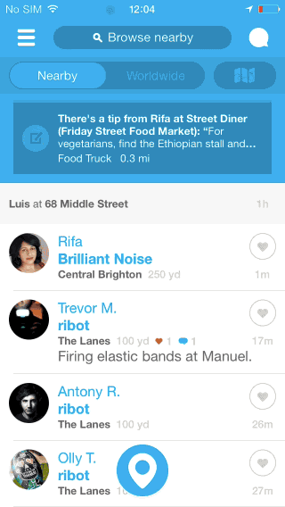
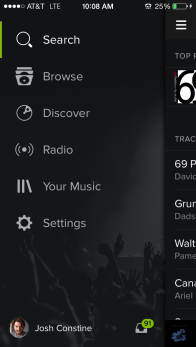
Occasionally, if an app is pretty much single-purpose already, hiding truly extraneous features in a sidebar can make sense. Take Lyft, where mostly you’re just booking a car, and very rarely need to visit your profile, payment info, or send invitations. But Spotify is shooting itself in the foot by hiding its important Browse, Discover, Radio, Playlists, and Inbox behind the hamburger.
So do it for your engineers, who work too hard building features for you to stuff them in the closet. Do it for your business team, which needs the engagement you lose because people don’t even remember what your app offers. But most of all, do it for your users. They downloaded your app because they had problems. Don’t banish the solutions to a side menu.
Throw Out Hamburger
Credit to  for this article

Thursday, 22 May 2014

Mobile Automation Testing - On real devices

Mobile Automation Testing, it seems to be what every mobile tester is currently trying to achieve. A fully synced process where we can program and run automation suites across multiple devices. There are a lot of  companies out there offering automation testing for devices on emulators charging a lot of money.

However I haven’t blogged on here for a while as after joining ASOS I have been tasked with the challenge of creating a full functional mobile automation suite. It is taking some time as we are creating the apps through Android Studio as opposed to Eclipse which is what I am used to.

If anyone has any tips on this process please feel free to contact me. Until then I hope in the foreseen future I will have accomplished setting this up.

Wednesday, 5 March 2014

App Internet Usage Surpasses PCs for the First Time (U.S.)

Ok, so I know this is specifically America, however its still a pretty big accomplishment, feel free to draw your own conclusions on this being replicated in the UK sometime soon. I have, I don't think it will be to long until we see these facts written about the UK market.

For the first time, mobile and tablet app internet usage in the U.S. has overtaken PCs… (finally).
We’ve seen it coming in the last few years as the apps economy has exploded, and the way users interact with their multi-devices has evolved dramatically. 
Mobile devices accounted for 55% of Internet usage in the United States in January. Apps made up 47% of Internet traffic and 8% of traffic came from mobile browsers, according to data from comScore, cited Thursday by research firm Enders Analysis. PCs clocked in at 45%.
Although total Internet usage on mobile devices has previously exceeded that on PCs, this is the first time it’s happened for app usage alone.
The shift follows a freefall in PC sales, which suffered their worst decline in history last year.
Smartphone adoption, meanwhile, increased 39%, acording to research firm IDC. This trend will likely continue thanks to improved user experience on mobile apps and the expansion of high-speed 4G access, said Andrew Lipsman, vice president of marketing and insights atcomScore (SCOR).
As of January, 55% of American adults had smartphones, while 42% owned tablets,according to the Pew Research Center. “
Here’s a look at US time spent using the internet by device (comScore):
140227104442-mobile-time-spent-620xa

Friday, 15 November 2013

Mobile App Testing by Google+

How the Google+ Team Tests Mobile Apps


“Mobile first” is the motto these days for many companies. However, being able to test a mobile app in a meaningful way is very challenging. On the Google+ team we have had our share of trial and error that has led us to successful strategies for testing mobile applications on both iOS and Android.

General

  • Understand the platform. Testing on Android is not the same as testing on iOS. The testing tools and frameworks available for each platform are significantly different. (e.g., Android uses Java while iOS uses Objective-C, UI layouts are built differently on each platform, UI testing frameworks also work very differently in both platforms.)
  • Stabilize your test suite and test environments. Flaky tests are worse than having no tests, because a flaky test pollutes your build health and decreases the credibility of your suite.
  • Break down testing into manageable pieces. There are too many complex pieces when testing on mobile (e.g., emulator/device state, actions triggered by the OS).
  • Provide a hermetic test environment for your tests. Mobile UI tests are flaky by nature; don’t add more flakiness to them by having external dependencies.
  • Unit tests are the backbone of your mobile test strategy. Try to separate the app code logic from the UI as much as possible. This separation will make unit tests more granular and faster.


Android Testing

Unit Tests
Separating UI code from code logic is especially hard in Android. For example, an Activity is expected to act as a controller and view at the same time; make sure you keep this in mind when writing unit tests. Another useful recommendation is to decouple unit tests from the Android emulator, this will remove the need to build an APK and install it and your tests will run much faster. Robolectric is a perfect tool for this; it stubs the implementation of the Android platform while running tests.

Hermetic UI Tests
A hermetic UI test typically runs as a test without network calls or external dependencies. Once the tests can run in a hermetic environment, a white box testing framework like Espresso can simulate user actions on the UI and is tightly coupled to the app code. Espresso will also synchronize your tests actions with events on the UI thread, reducing flakiness. More information on Espresso is coming in a future Google Testing Blog article.

Diagram: Non-Hermetic Flow vs. Hermetic Flow


Monkey Tests
Monkey tests look for crashes and ANRs by stressing your Android application. They exercise pseudo-random events like clicks or gestures on the app under test. Monkey test results are reproducible to a certain extent; timing and latency are not completely under your control and can cause a test failure. Re-running the same monkey test against the same configuration will often reproduce these failures, though. If you run them daily against different SDKs, they are very effective at catching bugs earlier in the development cycle of a new release.

iOS Testing

Unit Tests
Unit test frameworks like OCUnit, which comes bundled with Xcode, or GTMSenTestcase are both good choices.

Hermetic UI Tests
KIF has proven to be a powerful solution for writing Objective-C UI tests. It runs in-process which allows tests to be more tightly coupled with the app under test, making the tests inherently more stable. KIF allows iOS developers to write tests using the same language as their application.

Following the same paradigm as Android UI tests, you want Objective-C tests to be hermetic. A good approach is to mock the server with pre-canned responses. Since KIF tests run in-process, responses can be built programmatically, making tests easier to maintain and more stable.

Monkey Tests
iOS has no equivalent native tool for writing monkey tests as Android does, however this type of test still adds value in iOS (e.g. we found 16 crashes in one of our recent Google+ releases). The Google+ team developed their own custom monkey testing framework, but there are also many third-party options available.

Backend Testing

A mobile testing strategy is not complete without testing the integration between server backends and mobile clients. This is especially true when the release cycles of the mobile clients and backends are very different. A replay test strategy can be very effective at preventing backends from breaking mobile clients. The theory behind this strategy is to simulate mobile clients by having a set of golden request and response files that are known to be correct. The replay test suite should then send golden requests to the backend server and assert that the response returned by the server matches the expected golden response. Since client/server responses are often not completely deterministic, you will need to utilize a diffing tool that can ignore expected differences.

To make this strategy successful you need a way to seed a repeatable data set on the backend and make all dependencies that are not relevant to your backend hermetic. Using in-memory servers with fake data or an RPC replay to external dependencies are good ways of achieving repeatable data sets and hermetic environments. Google+ mobile backend uses Guice for dependency injection, which allows us to easily swap out dependencies with fake implementations during testing and seed data fixtures.

Diagram: Normal flow vs Replay Tests flow

Conclusion


Mobile app testing can be very challenging, but building a comprehensive test strategy that understands the nature of different platforms and tools is the key to success. Providing a reliable and hermetic test environment is as important as the tests you write. 

Finally, make sure you prioritize your automation efforts according to your team needs.

How to Prioritize:

  1. Unit tests: These should be your first priority in either Android or iOS. They run fast and are less flaky than any other type of tests.
  2. Backend tests: Make sure your backend doesn’t break your mobile clients. Breakages are very likely to happen when the release cycle of mobile clients and backends are different.
  3. UI tests: These are slower by nature and flaky. They also take more time to write and maintain. Make sure you provide coverage for at least the critical paths of your app.
  4. Monkey tests: This is the final step to complete your mobile automation strategy.