Friday, 3 October 2014

Pitfalls and prizes of ensuring quality mobile apps - The Guardian

Pitfalls and prizes of ensuring quality mobile apps

Bringing quality to the new Guardian mobile app went far beyond traditional QA practices
The new Guardian app for iOS and Android. Photograph: Guardian
The new Guardian app for iOS and Android Photograph: Guardian
The Guardian’s QA team has worked extensively with native mobile apps for several years, so when we began working on the next generation of the Guardian’s app we were aware of the difficulties that we were going to face when testing and ensuring the quality of the app. Principally, these would be getting test coverage across a wide range of devices and operating systems under hugely varying network conditions. Overcoming these obstacles in a way that can provide as much coverage as possible, without requiring an impractical level of QA resource, is the challenge of mobile testing.
Typically with the initial testing phase of mobile apps, features are developed and tested under very “sterile” conditions, using a consistent WiFi connection on devices that are well known to the developers and QAs. The reality, however, of mobile devices is that every device is different, even within devices of the same model – each user has a different combination of settings and apps. It is possible to test across a wide range of devices and emulators, but this will not come close to covering a significant percentage of your audience: our apps are available globally to over 6,700 unique types of device.
Connectivity can also vary wildly within a short period of time, meaning that data is not going to be handled in a conventional manner. It is straightforward to test using throttled connections to produce a slow connection, or gradually walk through different areas of a building to create mild fluctuations, however this is not an accurate reproduction of a user travelling through various signal zones. For example, we learnt a lot about our app when I took a trip to France, and used it on Eurostar. My signal fluctuated greatly as I hurtled through different signal areas, lost connection completely while in the tunnel, then re-emerged on a completely different network at the other end. Enjoyable as it would be for the QA team, we can’t send people under the channel every time we want to test connectivity.
The conventional approach to a problem requiring inordinate QA resource would be to automate as much testing as possible, which does provide value in the case of mobile testing. This doesn’t solve the problem of the endless permutations in device configurations and connections, however, as the tools do not exist to accurately and quickly create the situations in which to run your tests.
Therefore the solution is to get your apps in the hands of as many users as possible during as much of your development process as you are able to. For the next generation Guardian app, we took the following steps:

Everyone on the team uses the app

By ensuring that it is easy for everyone on the team, including non-technical staff, to be running up-to-date builds of the apps on their devices, you’ve already got a guaranteed, if small, audience to give feedback, report bugs, and generate metrics.

UX sessions

At the Guardian, we are fortunate to have an excellent lab for UX testingwith real users. We ran several sessions throughout the project with existing and prospective users to establish usage patterns and gather feedback. Everyone from the team attended these sessions, and while not directly a QA process, seeing users at first hand running early builds of the apps was able to greatly inform our development direction and QA process. You can read more about these sessions in this excellent articleby my colleagues Mario Andrade and Penny Allen.

Internal beta

As soon as the apps were at the point where users could read content, we rolled out an internal beta available to everyone in the company. This meant that they were running a barebones, very buggy app, however as soon as a new feature was complete, the beta would be updated to include it. It was a very unusual experience as a QA to be actively encouraging releases with bugs, but bugs are par for the course in a beta.

External beta

With a couple of months to go until launch, we released a version of our old Android app that invited users into a beta of the new app. This gave us several thousand users, all over the world, running the new product daily.

Crowdsourced testing

While the external and internal betas were aimed at more general use, we also took advantage of a crowd testing platform to run short cycles of testing aimed at specific areas of functionality, using a global base of professional testers.
Using any of these steps will help improve the quality of your apps, although depending on the circumstances that you are developing in, not all can be employed by everyone. If you are taking any of these approaches, though, it is essential to ensure that you are getting as much value as possible from your pre-release users:

Tracking

All apps should track usage, although more often than not implementing tracking is one of the last features to be added to an app. To get early user testing to work, tracking is vital. Only by knowing what areas of your app your users are using, when they’re using it, what device they are using etc can you truly understand how much risk you are averting for your project.

Understand the implications of the data you are seeing

Having tracking in place is one thing, but that only gives you the data. You need to understand this data, understand what its implications are for your testing, and be confident of your sample. For example, we found that while our iOS users were evenly spread across OS versions and devices, the Android users tended towards using more recent devices, far more than the audience for our old app. This meant that in order to ensure quality for our users on older devices, we needed to steer more of our regression testing effort than expected towards these older devices. It is also essential that you are able to trust your sample data. If there are doubts, or a lack of confidence in the quality of your tracking, or the spread of users in your sample group, your data is immediately undermined.

Crash logging

As well as tracking usage, crash analytics can further enhance your understanding of how your app is performing. The average beta user cannot, and should not be expected to provide detailed reproduction steps and valuable assets, such as a stack trace for any crash they may experience. By employing crash tracking tools such as Crittercism orBugSense you can get this data for every crash experienced by your users. Again, as per tracking, this is something you should always be doing with your apps, but by ensuring it is in place early, you can get maximum value from your beta users.

Keep your users engaged

Getting users on board for a beta is just the first step. You are asking users to give you feedback and report issues, while using features that may not be complete, so it really is the users helping you, rather than you giving the users a sneak preview of your new app. Therefore, keeping your users actively engaged should be viewed as a priority of any beta project. For example, we encouraged users to report any bugs or feedback on the Google+ page for the Android beta, and made sure to respond to them and advise them when fixes for their issues were on the way. The result was a thriving community around the beta, which you can see and join here. Since our initial launch, we are continuing to launch our new in-development features to the beta group first.
While these steps cannot take over the full responsibility of testing an app, as features must be finished, or at least in a viable state before being passed to users, they will greatly increase your coverage and address most of the issues around OS version and device fragmentation. Additionally, they will produce a vast amount of data that can inform a risk based approach to regression & automated testing, and has informed our approach to our new Hybrid2 automation framework, which we hope to be writing about in the near future. It must be remembered however, just as with all other approaches to testing, it is in essence a risk-based approach, and cannot be considered foolproof. The whole endeavour is steered towards reducing risk when it comes to releasing the app to production, however that does mean it completely eradicates risk. For example, you may have a sample group of 5,000 users running a beta version of your app, and see a crash that affects 10 users, so 0.2% of your sample. This would – completely reasonably depending on the crash stacktrace – be discounted as an extremely low risk issue, as it is most likely due to a specific condition of the user’s device, with nothing that the app can do to compensate for it. Once extrapolated to a million users when live, however, a bug that will affect 0.2% of your users is 2,000 users. Obviously this means that the metrics that are being monitored during the beta phase must continue to be reported and checked in production
Lastly, it is important to remember that all of these steps are beneficial to the wider team working on an app, not just QAs. For example, our UX team were able to get vast amounts of feedback from all the stages of our betas; the dev team were able to see the effects of greater load on our APIs and product decisions could be made with the backing of user data.
All information taken from
http://www.theguardian.com/info/developer-blog/2014/sep/29/pitfalls-and-prizes-of-ensuring-quality-mobile-apps

Wednesday, 25 June 2014

Building a Device Lab

Creating a device testing lab of any size can be a challenge. Whether you have three devices or 30, you still have to deal with:
  • Choosing which devices to use: whether they are used or new, and which give the most bang for your buck.
  • Organization: such as cabling, stands, labels, access to power, and ease of use.
  • Power: finding the right USB hub and power supply solutions, discovering which devices are faulting or overdrawing power, and monitoring energy consumption.
  • Setup: base imaging each device and having a standard, consistent config across the board for devices
  • User experience of the lab: ensuring your users plug things back in correctly, return them in a timely manner, have access to development environments and a default email app, and are able to check devices in/out so you know where the devices are.
Check out these two links below about how to build the ultimate device lab for Mobile Testing.

- http://velocityconf.com/velocity2014/public/schedule/detail/34185


- http://laraswanson.com/devicelab/

Wednesday, 28 May 2014

Kill The Hamburger Button


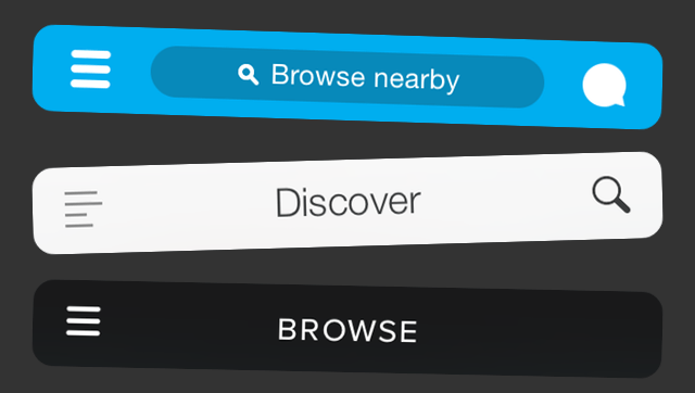
That little three-lined button is the devil. Whether you call it a side menu, navigation drawer, or a hamburger, hiding your features off-screen behind a nondescript icon in the corner is usually a poor mobile design choice. Interaction theory, A/B tests, and the evolution of some of the top apps in the world all support the same thesis: The hamburger button is bad for engagement, and you should probably replace it with a tab bar or other navigation scheme.
Even if you’re not a designer, I highly recommend reading Luis Abreu’s brilliant, GIF-filled deep-dive: Why And How To Avoid Hamburger Menus. Here’s the summary of his analysis plus several other studies and some context about how this is playing out across the most popular apps. There’s debate about web hamburgers, but I’m focusing on mobile with iOS as the examples, and much of this applies to Android.
burgerception-9e394612
Essentially, what’s out of sight is out of mind. Any navigation options you hide behind the hamburger will be forgotten, or at least used a lot less. It doesn’t help that the button is often placed in the top left corner — the hardest place to reach when using the phone with just your right hand.
Hamburger buttons are less efficient, since you have to tap once before you’re even allowed to see the option you want. They clash with the navigation patterns of many mobile apps, forcing you to swipe or ‘back’ through multiple screens just to arrive at the hamburger button. And they’re less glanceable, preventing you from seeing notifications about specific areas of an app such as notifications, messages, or new content without first opening the side menu.
foursquare-menu-aa8caf50
Yet despite these shortcomings, many apps still use the hamburger because it’s an easy way to cram a ton of functionality into an app. They’re especially tempting if you’re trying to translate a full-featured web app into a mobile one. But in the end, they obscure what’s special about your product.

One Solution: The Tab Bar.

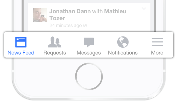
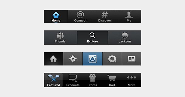
The tab bar is a row of persistently visible buttons typically at the bottom of the screen that open different parts of the app.
facebook-tab-bar1

Instead of hiding the navigation options in a drawer, you splay them out. This keeps users from forgetting they exist, makes multiple pieces of core functionality available with one tap, allows rapid switching between features without the need to retreat to the app’s homescreen, and lets you display notifications on each tab.
What you sacrifice is a bit of screen real estate, but it’s probably worth it. An A/B test by mobile app zeebox presented by The Next Web show just how damaging these drawbacks can be to an app’s engagement rate. Six months ago zeebox tried switching from a tab bar to a hamburger, and saw its metrics drop. Recently, it ran a simultaneous A/B test on the two navigation schemes and found the tab bar drove a 55 percent average weekly frequency of use, and an 8.7 percent higher average daily frequency.
HamburgersAndBasements-TabBars
There are also clever ways to make the tab bar disappear when it’s not in use. If the home screen is a scrolling feed, the tab bar can be hidden when people flick it up to unfurl new content, and revealed if they start pulling down trying to get back to the top. In an interface like a map where maximizing screen real estate is key, the tab bar can be hidden when a user taps or drags. It’s not perfect for all situations, but many information architectures are better conveyed this way.

Why It’s Time To Evolve

Users seem to want single-purpose mobile apps that nail a specific use case quickly. That’s why we’re in the midst of “The Great Unbundling Of 2014″. Big, bloated apps are trying to slim down and speed up by pushing some functionality into standalone or companion apps. Facebook’s Messenger and Foursquare’s Swarm are two prime examples.
But if the goal is unburying core features so they’re more prominent and easily accessible, ditching the hamburger button is a wise move. When Facebook launched Messenger, it was still using a hamburger button. Luckily with the shift to iOS 7, Facebook switched to a tab bar after a ton of testing showed it was the way to go.
facebook-ios-7
Left: Facebook’s old hamburger button navigation. Right: The new tab bar style
Facebook has more features than it can fit in five buttons along the bottom, so it still uses the last tab bar space to house a “More” hamburger revealing your profile, events, groups, and more. But that’s a much better compromise. A horizontal-scrolling tab bar with more tabs than fit on-screen is another option.
photo (6)Other popular apps sporting tab bars on iOS include Twitter, Instagram, Pinterest, Uber, Skype, WordPress, Quora, and the App Store. Many of them used to be saddled with hamburgers but came to their senses. Gmail, Google Maps, Pocket, TechCrunch’s own app, and many more still use the dreaded icon Norm Cox invented for Xerox around 1981.

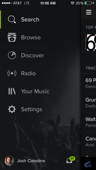
Occasionally, if an app is pretty much single-purpose already, hiding truly extraneous features in a sidebar can make sense. Take Lyft, where mostly you’re just booking a car, and very rarely need to visit your profile, payment info, or send invitations. But Spotify is shooting itself in the foot by hiding its important Browse, Discover, Radio, Playlists, and Inbox behind the hamburger.
So do it for your engineers, who work too hard building features for you to stuff them in the closet. Do it for your business team, which needs the engagement you lose because people don’t even remember what your app offers. But most of all, do it for your users. They downloaded your app because they had problems. Don’t banish the solutions to a side menu.
Throw Out Hamburger
Credit to  for this article

Thursday, 22 May 2014

Mobile Automation Testing - On real devices

Mobile Automation Testing, it seems to be what every mobile tester is currently trying to achieve. A fully synced process where we can program and run automation suites across multiple devices. There are a lot of  companies out there offering automation testing for devices on emulators charging a lot of money.

However I haven’t blogged on here for a while as after joining ASOS I have been tasked with the challenge of creating a full functional mobile automation suite. It is taking some time as we are creating the apps through Android Studio as opposed to Eclipse which is what I am used to.

If anyone has any tips on this process please feel free to contact me. Until then I hope in the foreseen future I will have accomplished setting this up.

Wednesday, 5 March 2014

App Internet Usage Surpasses PCs for the First Time (U.S.)

Ok, so I know this is specifically America, however its still a pretty big accomplishment, feel free to draw your own conclusions on this being replicated in the UK sometime soon. I have, I don't think it will be to long until we see these facts written about the UK market.

For the first time, mobile and tablet app internet usage in the U.S. has overtaken PCs… (finally).
We’ve seen it coming in the last few years as the apps economy has exploded, and the way users interact with their multi-devices has evolved dramatically. 
Mobile devices accounted for 55% of Internet usage in the United States in January. Apps made up 47% of Internet traffic and 8% of traffic came from mobile browsers, according to data from comScore, cited Thursday by research firm Enders Analysis. PCs clocked in at 45%.
Although total Internet usage on mobile devices has previously exceeded that on PCs, this is the first time it’s happened for app usage alone.
The shift follows a freefall in PC sales, which suffered their worst decline in history last year.
Smartphone adoption, meanwhile, increased 39%, acording to research firm IDC. This trend will likely continue thanks to improved user experience on mobile apps and the expansion of high-speed 4G access, said Andrew Lipsman, vice president of marketing and insights atcomScore (SCOR).
As of January, 55% of American adults had smartphones, while 42% owned tablets,according to the Pew Research Center. “
Here’s a look at US time spent using the internet by device (comScore):
140227104442-mobile-time-spent-620xa

Friday, 15 November 2013

Mobile App Testing by Google+

How the Google+ Team Tests Mobile Apps


“Mobile first” is the motto these days for many companies. However, being able to test a mobile app in a meaningful way is very challenging. On the Google+ team we have had our share of trial and error that has led us to successful strategies for testing mobile applications on both iOS and Android.

General

  • Understand the platform. Testing on Android is not the same as testing on iOS. The testing tools and frameworks available for each platform are significantly different. (e.g., Android uses Java while iOS uses Objective-C, UI layouts are built differently on each platform, UI testing frameworks also work very differently in both platforms.)
  • Stabilize your test suite and test environments. Flaky tests are worse than having no tests, because a flaky test pollutes your build health and decreases the credibility of your suite.
  • Break down testing into manageable pieces. There are too many complex pieces when testing on mobile (e.g., emulator/device state, actions triggered by the OS).
  • Provide a hermetic test environment for your tests. Mobile UI tests are flaky by nature; don’t add more flakiness to them by having external dependencies.
  • Unit tests are the backbone of your mobile test strategy. Try to separate the app code logic from the UI as much as possible. This separation will make unit tests more granular and faster.


Android Testing

Unit Tests
Separating UI code from code logic is especially hard in Android. For example, an Activity is expected to act as a controller and view at the same time; make sure you keep this in mind when writing unit tests. Another useful recommendation is to decouple unit tests from the Android emulator, this will remove the need to build an APK and install it and your tests will run much faster. Robolectric is a perfect tool for this; it stubs the implementation of the Android platform while running tests.

Hermetic UI Tests
A hermetic UI test typically runs as a test without network calls or external dependencies. Once the tests can run in a hermetic environment, a white box testing framework like Espresso can simulate user actions on the UI and is tightly coupled to the app code. Espresso will also synchronize your tests actions with events on the UI thread, reducing flakiness. More information on Espresso is coming in a future Google Testing Blog article.

Diagram: Non-Hermetic Flow vs. Hermetic Flow


Monkey Tests
Monkey tests look for crashes and ANRs by stressing your Android application. They exercise pseudo-random events like clicks or gestures on the app under test. Monkey test results are reproducible to a certain extent; timing and latency are not completely under your control and can cause a test failure. Re-running the same monkey test against the same configuration will often reproduce these failures, though. If you run them daily against different SDKs, they are very effective at catching bugs earlier in the development cycle of a new release.

iOS Testing

Unit Tests
Unit test frameworks like OCUnit, which comes bundled with Xcode, or GTMSenTestcase are both good choices.

Hermetic UI Tests
KIF has proven to be a powerful solution for writing Objective-C UI tests. It runs in-process which allows tests to be more tightly coupled with the app under test, making the tests inherently more stable. KIF allows iOS developers to write tests using the same language as their application.

Following the same paradigm as Android UI tests, you want Objective-C tests to be hermetic. A good approach is to mock the server with pre-canned responses. Since KIF tests run in-process, responses can be built programmatically, making tests easier to maintain and more stable.

Monkey Tests
iOS has no equivalent native tool for writing monkey tests as Android does, however this type of test still adds value in iOS (e.g. we found 16 crashes in one of our recent Google+ releases). The Google+ team developed their own custom monkey testing framework, but there are also many third-party options available.

Backend Testing

A mobile testing strategy is not complete without testing the integration between server backends and mobile clients. This is especially true when the release cycles of the mobile clients and backends are very different. A replay test strategy can be very effective at preventing backends from breaking mobile clients. The theory behind this strategy is to simulate mobile clients by having a set of golden request and response files that are known to be correct. The replay test suite should then send golden requests to the backend server and assert that the response returned by the server matches the expected golden response. Since client/server responses are often not completely deterministic, you will need to utilize a diffing tool that can ignore expected differences.

To make this strategy successful you need a way to seed a repeatable data set on the backend and make all dependencies that are not relevant to your backend hermetic. Using in-memory servers with fake data or an RPC replay to external dependencies are good ways of achieving repeatable data sets and hermetic environments. Google+ mobile backend uses Guice for dependency injection, which allows us to easily swap out dependencies with fake implementations during testing and seed data fixtures.

Diagram: Normal flow vs Replay Tests flow

Conclusion


Mobile app testing can be very challenging, but building a comprehensive test strategy that understands the nature of different platforms and tools is the key to success. Providing a reliable and hermetic test environment is as important as the tests you write. 

Finally, make sure you prioritize your automation efforts according to your team needs.

How to Prioritize:

  1. Unit tests: These should be your first priority in either Android or iOS. They run fast and are less flaky than any other type of tests.
  2. Backend tests: Make sure your backend doesn’t break your mobile clients. Breakages are very likely to happen when the release cycle of mobile clients and backends are different.
  3. UI tests: These are slower by nature and flaky. They also take more time to write and maintain. Make sure you provide coverage for at least the critical paths of your app.
  4. Monkey tests: This is the final step to complete your mobile automation strategy. 

Friday, 1 November 2013

Addressing The Responsive Images Performance Problem: A Case Study

Five-inch mobile devices are on the market that have the same screen resolution as 50-inch TVs. We have users with unlimited high-speed broadband as well as users who pay money for each megabyte transferred. Responsive design for images is about optimizing the process of serving images to users. In this article, we will share our responsive image technique, the “padding-bottom” technique, which we researched and implemented on the mobile version of the Swedish news website Aftonbladet.

The techniques presented here are the result of a few weeks of research that we did in October 2012. We were fortunate enough to be a part of the team that built a new responsive mobile website for Aftonbladet. Aftonbladet is Sweden’s largest website, and its mobile version gets about 3 million unique users and up to 100 million page views per week.

With that amount of users, we felt it was our responsibility to make a fast and well-optimized website. Saving just 100 KB of image data per page view would translate into a lot of terabytes of data traffic saved in Sweden per year. We started out by researching other responsive image techniques, but because none of them was a perfect match, we ended up combining some of the best hacks into our own solution. Please note that this project covered only a responsive mobile website; but do not worry — the technique presented here applies to all types of responsive websites.


The Specification

We started out by creating a simple specification in order to select a suitable responsive image solution. The solution had to:
  • be easy to cache,
  • multiserve images.
Let’s go through these requirements and see what they mean.


Easy to Cache

With a website that gets traffic peaks of over 10,000 requests per second, we wanted to keep the server logic as simple as possible. This means that we didn’t want to use server-side device detection or a cookie-based solution that serves multiple versions of the HTML. We needed a single HTML file to be served to all users, although manipulating the HTML with JavaScript after it has loaded is acceptable. The same rules apply to images; we needed to be able to put the images on a content delivery network (CDN), and we did not want any dynamics in the image-serving logic.

Multiserving Images

We wanted to serve different image versions to different devices. One big complaint about our previous mobile website was that high-DPI iPhones and Android devices did not get the high-resolution images they deserved. So, we wanted to improve image quality, but only for the devices that were capable of displaying it.


Loading Images With JavaScript

JavaScript, if placed in the footer where it should be, will load after the HTML and CSS has been parsed. This means that, if JavaScript is responsible for loading images, we can’t take advantage of the browser’s preloader, and so an image will start downloading a fair bit later than normal. This is not good, of course, and it reveals another problem: The page might reflow every time the JavaScript inserts an image into the DOM.
Reflowing happens when the browser recalculates the dimensions of the elements on the page and redraws them. We have set up a demo page and a video that demonstrate this effect. Note that the demo page has an inserted delay of 500 milliseconds between each image in order to simulate a slow connection speed.
As you can see from the video, another very annoying feature is that the user will likely get lost in the reflowing when returning to a page with the “Back” button. This is actually a serious problem for websites such as Aftonbladet. Having a functional “Back” button will keep users longer on the website.
The reflowing problem would not really be present on a website that is not responsive because we would be able to set a width and height in pixels on the image tag:
<img src="img.jpg" width="60" height="60"/>
One important aspect of responsive Web design is to remove those hardcoded attributes and to make images fluid, with CSS:
img {
 max-width: 100%;
}


No More max-width: 100%

We needed to find a solution whereby we could reserve space for an image with only HTML and CSS and, thus, avoid reflowing. That is, when the JavaScript inserts an image into the page, it would just be inserted in the reserved area and we would avoid reflowing. So, we threw out one of the cornerstones of responsive Web design, img { max-width: 100% }, and searched for another solution that could reserve space for a responsive image. What we needed was something that specifies just the aspect ratio of the image and lets the height shrink with the width. And we found a solution.


The Padding-Bottom Hack

This technique is based on something called intrinsic ratios, but because none of our team’s members could remember, understand or pronounce the term “intrinsic” we just called it the “padding-bottom hack.”
Many people learned about this feature back in 2009 in A List Apart’s article “Creating Intrinsic Ratios for Video,” by Thierry Koblentz, and the technique is often used to embed third-party content and media on responsive websites. With the technique, we define the height as a measure relative to the width. Padding and margin have such intrinsic properties, and we can use them to create aspect ratios for elements that do not have any content in them.
Because padding has this capability, we can set padding-bottom to be relative to the width of an element. If we also set height to be 0, we’ll get what we want.
.img-container {
 padding-bottom: 56.25%; /* 16:9 ratio */
 height: 0;
 background-color: black;
}
The next step is to place an image inside the container and make sure it fills up the container. To do this, we need to position the image absolutely inside the container, like so:
.img-container {
 position: relative;
 padding-bottom: 56.25%; /* 16:9 ratio */
 height: 0;
 overflow: hidden;
}

.img-container img {
 position: absolute;
 top: 0;
 left: 0;
 width: 100%;
 height: 100%;
}

The container reserves the space needed for the image.

Now we can tweak our demo, applying the padding-bottom hack, and the user will no longer get lost in the reflowing that we saw earlier. Also, the “Back” button functions as expected. See the new video and demo.
This technique improves the user experience of the website quite a bit over the traditional max-width approach, but the experienced reader will by now have noticed two things:
  1. We need to know the aspect ratio of the image before we load an image.
  2. Images could be scaled up larger than their original size.
To handle the aspect ratios, you need either to have a content management system with which you can control the templates or to have a limited, fixed set of aspect ratios for images. If you have something in between, whereby you cannot affect how image tags are rendered, then this method will probably be hard to use.
At Aftonbladet, we decided to calculate the padding-bottom percentage on the server and print it out as an inline style in the HTML, as you will see in the following code snippets. For the second problem, we found that, for our use case, letting the image scale up if needed (and losing some quality) was actually better than setting a fixed maximum width for the image.


Choosing An Image-Loading Technique

Now that we’ve allowed ourselves to load images with JavaScript, because we’ve minimized the reflowing, we can set up the requirements for this:
  • The resulting HTML should be a single img tag.
  • The DOM elements should be minimal.
  • It should execute as quickly as possible.
  • It should not break when JavaScript is disabled.
Based on this simple specification, we created an inline vanilla JavaScript, based on the “noscript” technique. The idea is to add the information about different image sizes to the HTML as data attributes in a noscript tag. The content of the noscript tag would be an img tag and would be shown to browsers that have JavaScript turned off. Let’s look at the markup:
<noscript data-src-small="img-small.jpg" 
    data-src-medium="img-medium.jpg" 
    data-src-high="img-high" 
    data-src-x-high="img-x-high.jpg">
        <img src="img-small.jpg">
</noscript>
The job of the JavaScript, then, is to parse the content of the page, identify images that should be lazy-loaded, check the size of the device’s screen and pick the correct image. The following code would look for images to load and insert them into the DOM. It is important that the JavaScript be inline and load as soon as possible after the HTML. The script would also retrieve the alt tag from the noscript tag and insert it into the newly created img tag.
 var lazyloadImage = function (imageContainer) {

  var imageVersion = getImageVersion();

  if (!imageContainer || !imageContainer.children) {
   return;
  }
  var img = imageContainer.children[0];

  if (img) {
   var imgSRC = img.getAttribute("data-src-" + imageVersion);
   var altTxt = img.getAttribute("data-alt");
   if (imgSRC) {
    var imageElement = new Image();
    imageElement.src = imgSRC;
    imageElement.setAttribute("alt", altTxt ? altTxt : "");
    imageContainer.appendChild(imageElement);
    imageContainer.removeChild(imageContainer.children[0]);
   }
  }
 },
 lazyLoadedImages = document.getElementsByClassName("lazy-load");

 for (var i = 0; i < lazyLoadedImages.length; i++) {
  lazyloadImage(lazyLoadedImages[i]);
 }


Picking The Perfect Image

So far, the techniques described here generally apply to any website that implements responsive images. The last step, selecting the image to send to the browser, is different in the way that it has to be adapted to the needs of the website.
Many factors need to to be considered when choosing the optimal image to send to a particular device, such as screen size, network speed, cacheability, overall page weight and the user’s preference. The website we built for Aftonbladet mainly targets mobile browsers, and we were lucky enough to have a lot of statistics on the average user’s behavior. By analyzing the numbers, we could identify some trends.
First, the vast majority hold their device in portrait mode. For reading and browsing articles, portrait mode is the natural choice. And while screen size varies a lot, over 99% of the traffic we analyzed represent devices with a viewport width of either 320 or 360 pixels.
Secondly, most of the visiting devices have high-density screens, with a native width of 480, 640, 720 or 1080 pixels. The highest resolutions come from newer phones, such as the Galaxy S4 and Xperia Z; while a 1080 pixel-wide image looks great on those phones, tests showed that a 720 pixel-wide image would look good enough, with less of a bandwidth cost.
After analyzing the data, we settled on three versions for each image:
  • small (optimized for a 320 pixel-wide screen),
  • medium (optimized for a 640 pixel-wide screen),
  • large (optimized for a 720 pixel-wide screen).
(Devices without JavaScript would get the small image.) We believe these settings are reasonable for a mobile website, but a fully responsive website that targets all kinds of devices would probably benefit from different settings.
We give the versions logical names, instead of specifying media queries in the markup. We choose to do it this way for flexibility. This makes it easier to evolve the JavaScript in the future to, for example, adapt to network speed or enable a user setting that overrides which image to use. In its simplest form, the engine for selecting image versions could be implemented as in the following example (although, to support Internet Explorer, we’d need another function as a workaround for the absence of window.devicePixelRatio).
var getImageVersion = function() {
         var devicePixelRatio = getDevicePixelRatio(); /* Function defined elsewhere.*/
         var width = window.innerWidth * devicePixelRatio;
         if (width > 640) {
                     return "high";
         } else if (width > 320) {
                     return "medium";
         } else {
                     return "small"; // default version
         }
};
We also tried to take the screen’s height into account when selecting the right image. In theory, this would have been a nice complement to make sure that the image is well suited to the device. But when we tested the theory in the real world, we soon found too many edge cases that made it impossible to detect the height in a way that was good enough.
Apps that embed Web views inside scroll views reported a seemingly random height between 0 and 3000 pixels, and features such as Samsung’s TouchWiz system, which has a split-screen mode, made us abandon the screen’s height as a reliable value for choosing image sizes.
We created a simple demo page that has all of the JavaScript and CSS needed. But keep in mind that our code is targeted at mobile devices, so it doesn’t work out of the box in, say, old Internet Explorer browsers.


Making Smaller Images

Large beautiful images use up a lot of bandwidth. Downloading a lot of 720 pixel-wide images on a cellular network can be both slow and costly for the user. While a new image format such as WebP would help some users, it is not supported by enough browsers to be viable as the only solution. Fortunately, thanks to research by Daan Jobsis, we can take advantage of the fact that a high compression rate doesn’t affect the perceived quality of an image very much if the image’s dimensions are larger than displayed or if the image is displayed at its native size on a high-density screen.
With aggressive JPEG compression, it is, therefore, possible to maintain a reasonable download size while still having images look beautiful on high-density displays. We already had an image server that could generate scaled, cropped and compressed images on the fly, so it was just a matter of choosing the right settings.
This is also one reason why we didn’t include an image version for 480-pixel screens. Scaling down a 640 pixel-wide image with a high compression level made for a better-looking image at a smaller size than we could achieve with an image that had the native resolution of the 480-pixel screen. In this case, we decided that making the device scale the image to fit was worth it.


Red Areas Don’t Compress Well

A high compression rate is no silver bullet, though. Some images look terrible when compressed, especially ones with prominent bright-red areas, in which JPEG compression artifacts would be clearly visible and could spoil the overall impression of the image. Unfortunately, the editors at Aftonbladet have a fondness for images with prominent bright-red areas, which made our task just a little more challenging.
artifacts
These two images are saved with a 30% quality setting. While the image on the left might be passable even on a normal screen, the red circle in the right image looks bad even on a high-density screen.


Finding a Compromise

We could solve this problem in a few ways. We could increase the dimensions and compression of the images even more, which would make the artifacts less visible. This would mean that the browser has to scale images while rendering the page, which could have a performance impact. It would also require larger source images, which in practice are not always available. Another solution would be to let the editors choose how compression should be handled for each image, but this would add another step to the editors’ workflow, and we would need to educate them on the intricacies of how image compression, size, performance and mobile devices work together.
In the end, we settled on a compromise and avoided using high compression rates for important images and image galleries, instances where the image is the center of attention. In these cases, we also make sure to load only the visible images, to not waste the user’s bandwidth.

quality
The teaser images on Aftonbladet’s section pages (left) work really well with high compression levels, while a full-screen image gallery (right) benefits from higher-quality images.

Generating the different images can be problematic. We have the luxury of an existing back end that can scale, compress and crop images on demand. Rolling your own might entail a lot of work, but implementing it as, for example, a WordPress plugin (using the WP_Image_Editor class) would actually be pretty straightforward.


The Bottom Line

Three years after Ethan Marcotte introduced responsive Web design, we’re still struggling to find a good solution to the problem of how to handle images. All responsive image solutions are more or less a hack, and so is this one. But we have managed to escape the excessive reflowing problem, we have not introduced a lot of unneeded DOM elements, we have a cacheable website, and we prevent images that aren’t used from being downloaded.
Aftonbladet’s home page on a mobile device has around 40 images and, with this technique, ends up being around 650 KB on a “large screen,” 570 KB on a medium screen and 450 KB on a small screen (although the size varies according to the content). Without the high compression rate, the large and medium versions would be over a megabyte in size. And compared to the old website, we’ve managed to move from blurry low-resolution images to high-quality images tailored to each device, with just a 25% increase in download size.
So, we are still waiting for the perfect solution to responsive images. In the meantime, what we have outlined above has been a success for Aftonbladet’s new responsive website and hybrid apps. The new website (whose perceived loading time is twice as fast as that of the old one) has led to a huge boost in traffic and user interaction; and all through the summer, traffic to Aftonbladet’s mobile version has been higher than traffic to the desktop and tablet versions.

Tuesday, 13 November 2012

Responsive Navigation: Optimizing for Touch Across Devices


I wanted to share this with people as I think it is a fantastic post and is a great read for any mobile Developers / Marketers. It is written by Jason Weaver & Luke Wroblewski. Enjoy. 
As more diverse devices embrace touch as a primary input method, it may be time to revisit navigation standards on the Web. How can a navigation menu be designed to work across a wide range of touch screen sizes? 

The Demos

Why do these navigation menus work across a wide range of touch screen sizes? Why do we care about touch across a wide range of screen sizes? Read on...

Across Screen Sizes

First, why do we care about touch across a wide range of screen sizes? Isn't touch just used on mobile devices and tablets? While it's true touch interfaces are increasingly present on small screen sizes, there's a lot of diversity even in this class of devices. Consider in the past two months smartphones ranging from 3.5" to 5.5" have been released by major manufacturers.
smartphone screen sizes from 4 to 5.5 inches
Tablets are no different. Again in the past two months alone we've seen tablets released with 7" screens, 10.1" screens, and everything in between.
tablet screen sizes from 7 to 10.1 inches
And the very notion of what defines a tablet is being challenged by laptop/tablet convertibles and touch-enabled Ultrabooks. These devices range from 11.6" to 13.3" inch screens and treat touch as a primary input method. In fact, early testing by Intel found that touch was even a preferred input method on touch enabled laptops.
convertible tablet/laptop devices ranging from 11.6 to 13.3 inches
Even beyond 13 inches, touch and gesture interfaces are possible. Consider Sony's 20" VAIO Tapor the use of a gesture interface like Leap Motion on any sized-screen and really quickly you realize touch is an input model to consider across all screen sizes.

Accounting For Touch

So what does it mean to consider touch across all screen sizes? Two things: touch target sizesand placement of controls. Any navigation system that needs to work with touch needs to have menu options that can be comfortably used with imprecise fingers. It also needs to be positioned in a way that aligns with how people hold and use touch-enabled devices.
Touch target sizes are relatively easy: just make things big enough to prevent accidental taps and errors. Your reaction to this may be "but I have so many things to fit in my app. How can I do that if the touch targets have to be so big?" frankly you can't and quite often that's a good thing.
Designing towards touch really forces us to simplify and decide what's most important- what needs to stay on the screen. If we go through that exercise we ultimately end up with software that's easier to understand and as a result more often used. Both good things. And while big touch targets can be comfortably used with a mouse (in fact they'll be easier to hit with a mouse), small mouse size targets can't be used easily with touch. So when in doubt, optimizing for touch will make sure things are usable for both mouse and touch users.
But accounting for touch isn't just about the size of controls, the placement of controls is important as well. To understand why this matters, let's look at how people hold a smartphone. In each of these examples, the bias is toward right handed use as most people in the world are right handed.
how people hold smartphones
These common patterns of posture create easy to hit and hard to reach touch areas. The area toward the bottom of the screen is easy, whereas the upper corners are a bit of stretch. So the bottom area of a smartphone screen is where we want to put an application's most common and important interactions. Where they can be reached quickly and easily.
comfortable touch areas on smartphones
Similarly we can look at tablet postures or how people typically hold tablet computers. That is two hands along the sides, or typing over the screen in their lap. In the landscape postures we see a different series of easy, ok, and hard to hit touch areas.
how people hold tablets
comfortable touch area on tablets
With touch-enabled laptops, people get pretty close to the screen and use their two thumbs to tap which yields easy to hit areas in the bottom corner of the screen.
comfortable touch areas on touch-enabled laptops
As you've hopefully observed the common pattern here is comfortable touch surfaces toward the bottom of the screen. Looking at the ergonomics of use across devices types pushes us toward the bottom, which is where we'd ideally like to place important functionality like navigation controls.

An Adaptive Solution

Today, most Web navigation systems are designed for a mouse and keyboard world. They're placed prominently across the top of the screen or along the sides. In other words, everywhere but in easy to touch areas.
In our earlier multi-device designs, we accounted for this convention by creating a series of navigation structures that adapted from comfortable touch zones on small screen devices to the kinds of navigation structures people have come to expect on desktop and laptop computers (top of screen, etc.). You can see a number of these explorations in Off Canvas Multi-Device Layouts.
multi device navigation
But given how things are changing and touch is permeating nearly every sized screen, it may be time to revisit that structure. Specifically, rather than optimizing for touch only on small screens, optimizing for it on all screens. That means big touch targets and bottom positioning throughout.
Of course we still have to account for varying screen widths, so our navigation controls will have to change as more space becomes available. To account for this, we decided to shift from a single row navigation structure on small screens to a split row model on larger screen sizes.
multi device touch optimized navigation
You can see this technique in action in the sample pages below:
Whether or not this multi-device navigation structure is the best answer for an increasingly touch-enabled computing world remains to be seen. However, rethinking our existing conventions is exactly the kind of thing we should be doing during the kind of fundamental changes we are seeing today. New input methods and devices are challenging our long-standing assumptions and that's a good thing for Web design.
Thanks to Jason Weaver for bringing these ideas to life! Check out some of our other multi-device collaborations in: